Vertically Center Summary Block List
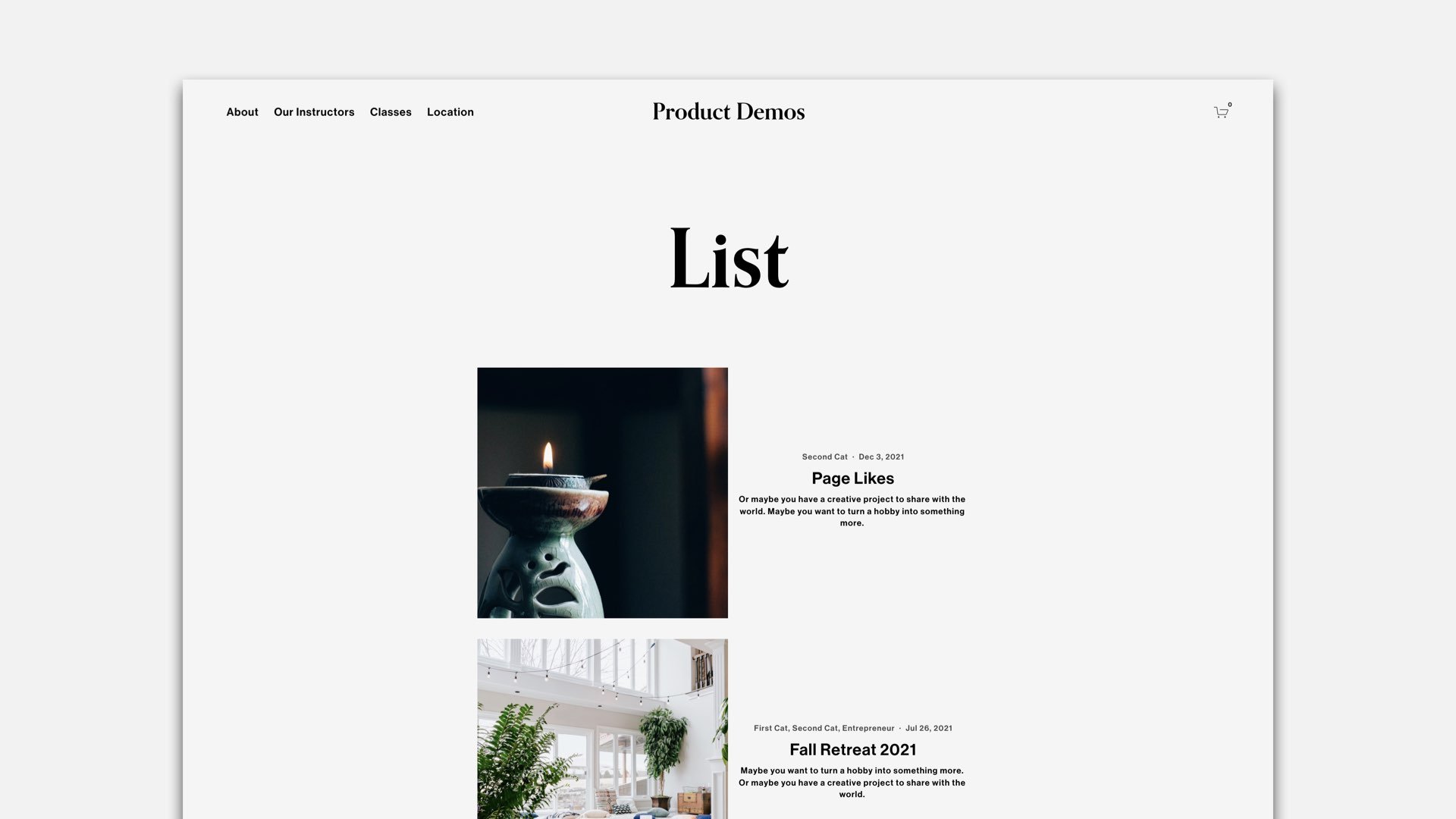
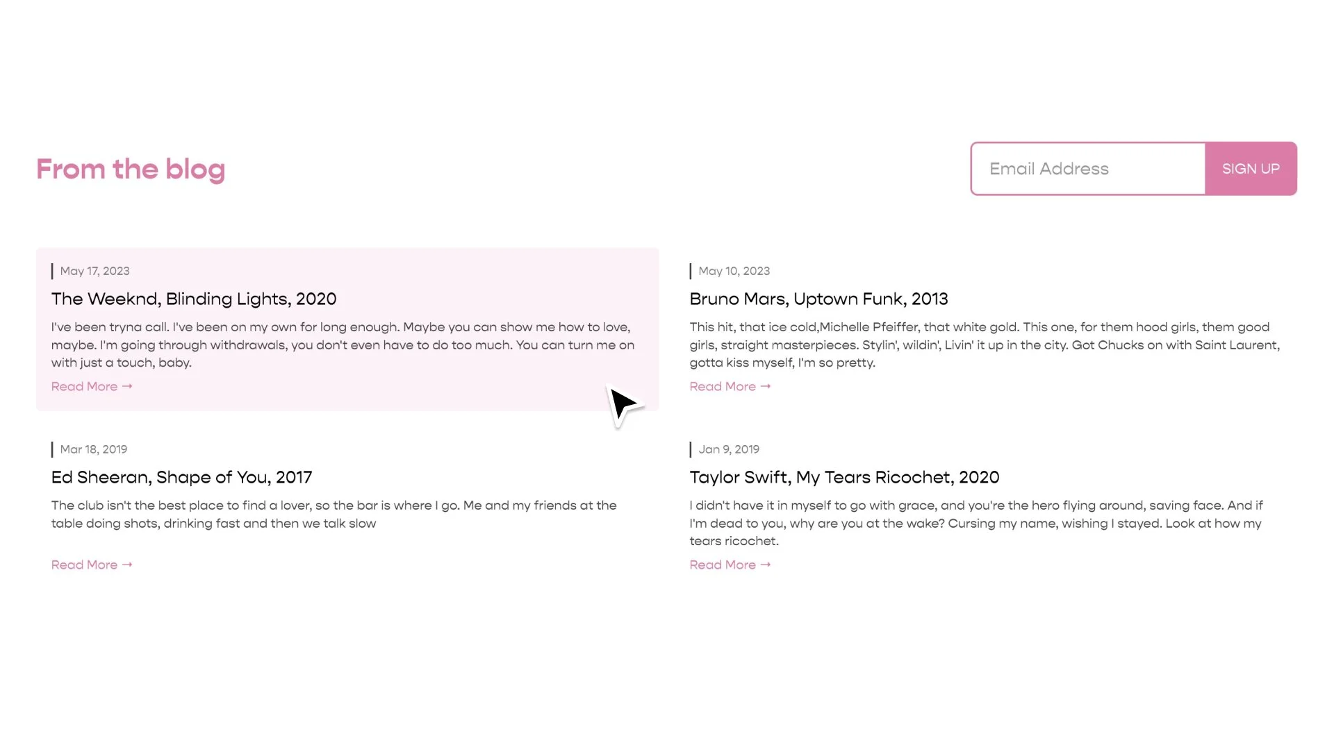
The “List” layout of summary blocks align the content on the top. In this tutorial, we learn the code to vertically align the summary blocks content so that it’s centered with the summary blocks image.
Copy and paste the below code into your Custom CSS area. Replace the #BlockID with the specific #BlockID of the summary Block on your page, use this tool for help finding it.
flex-direction:row
Adjust this property to row-reverse to have the image on the left.
padding: 17px
Adjust the padding on the .summary-content element to increase or reduce the spacing around the content.
/**
* Summary Block List Layout
* Vertically Center
**/
#block-id {
  .summary-item {
    display: flex;
    flex-direction:row;
    align-items: center;
  }
  .summary-thumbnail-outer-container{
    a{
      padding-right: 0px;
      padding-left: 0px;
    }
  }
  .summary-content {
    padding: 17px;
  }

  /*Stack Images & Content on Mobile*/
  @media (max-width: 767px) {
    .summary-item {
      flex-direction: column;
    }
    .summary-item > * {
      width: 100% !important;
    }
  }
}
Related Code Snippets
The below Code Snippets are available to Code Curious members.

