Show Multiple Logos for Auto List Carousel on Mobile
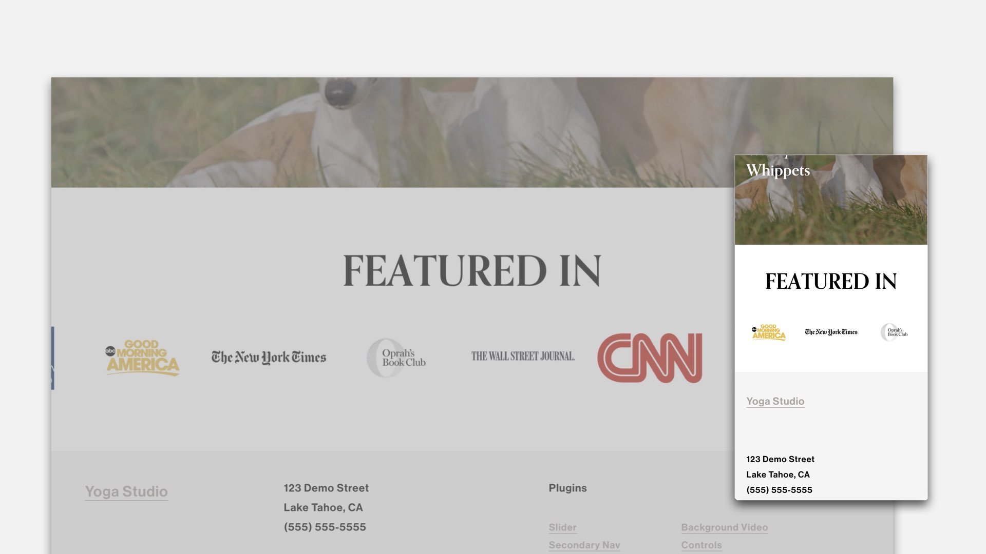
The Auto List Carousel Section allows you to scroll through a carousel of items; however, we’re limited to only seeing one item at a time on mobile. In this tutorial, I’ll walk you through how to increase the number of viewable items on mobile and tablet for the Auto List Carousel section.
Paste the below code into your Design » Custom CSS area.
Replace the section-id with the specific section of your Auto List section. Use this tool if you need help finding your section-id.
grid-template-columns
Replace the first number within the repeat() function to adjust the number of items shown. Leave the 1fr in place.
display
Feel free to remove the display property within the mobile-arrows selector. Removing this would show the arrows on mobile.
/**
* Auto List Carousel
* Home Page
* Add Multiple Items on
* Mobile & Tablet
**/

section[data-section-id="123"]{
  //Tablet
  @media (max-width: 1024px) {
    .user-items-list-carousel__slides {
      grid-template-columns: ~"repeat(4,1fr)" !important;
    }
  }

  //Mobile
  @media (max-width: 767px) {
    .user-items-list-carousel__slides {
      grid-template-columns: ~"repeat(3,1fr)" !important;
    }
  }

  .mobile-arrows{
    display:none
  }
}
Thanks for the great question Kat!
Related Code Snippets
The below Code Snippets are available to Code Curious members.

