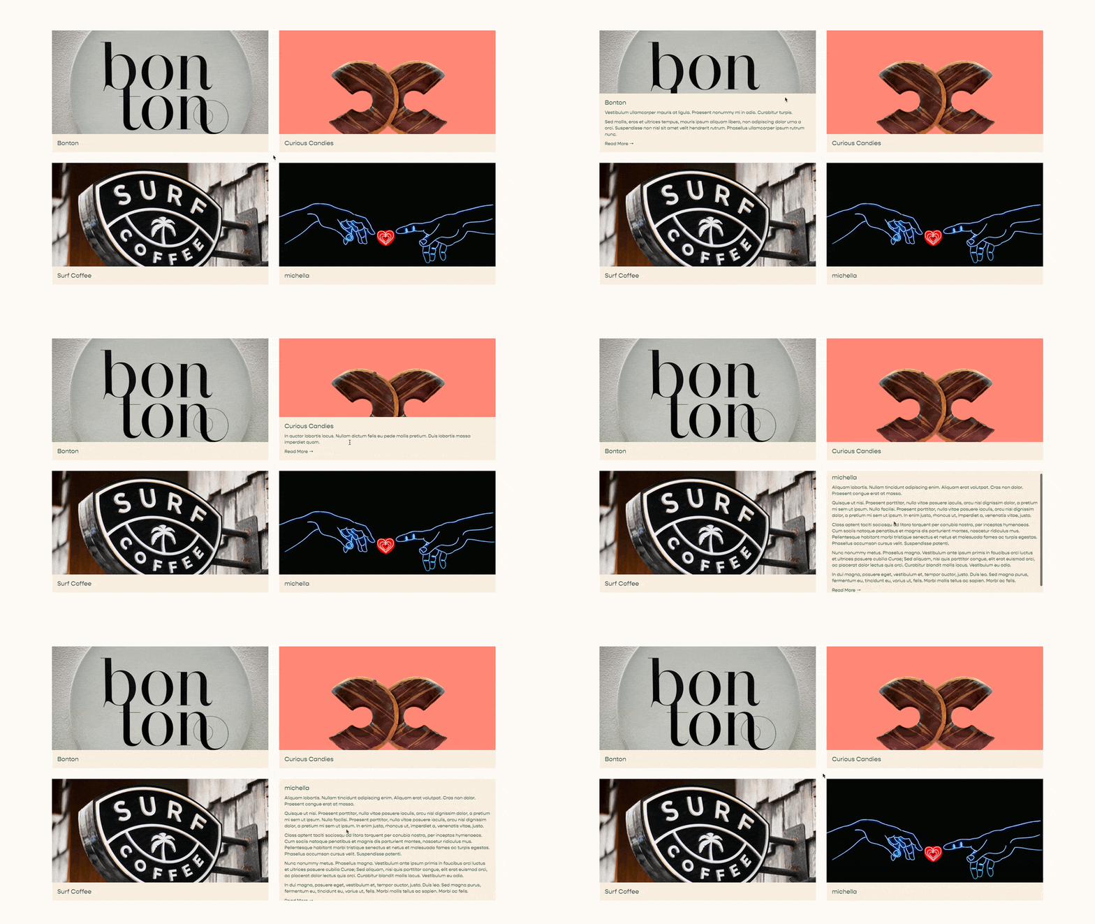
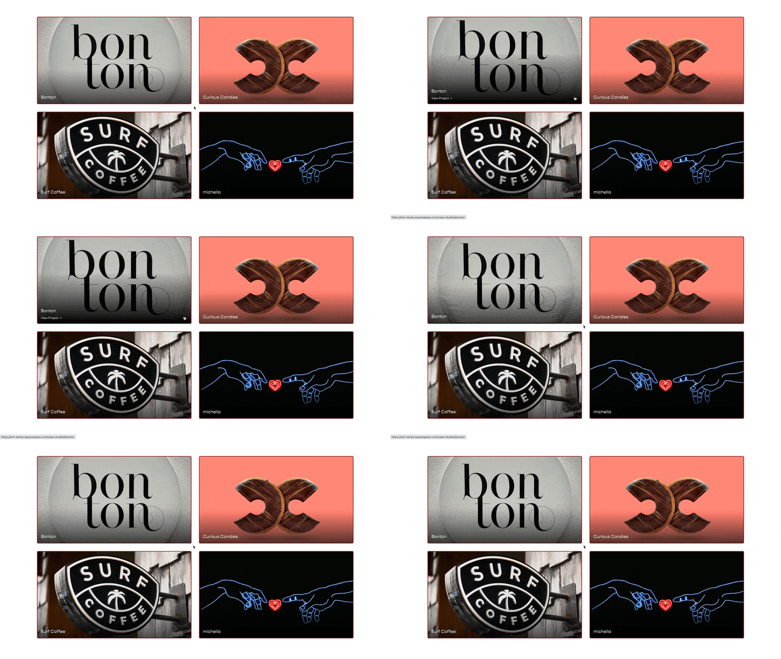
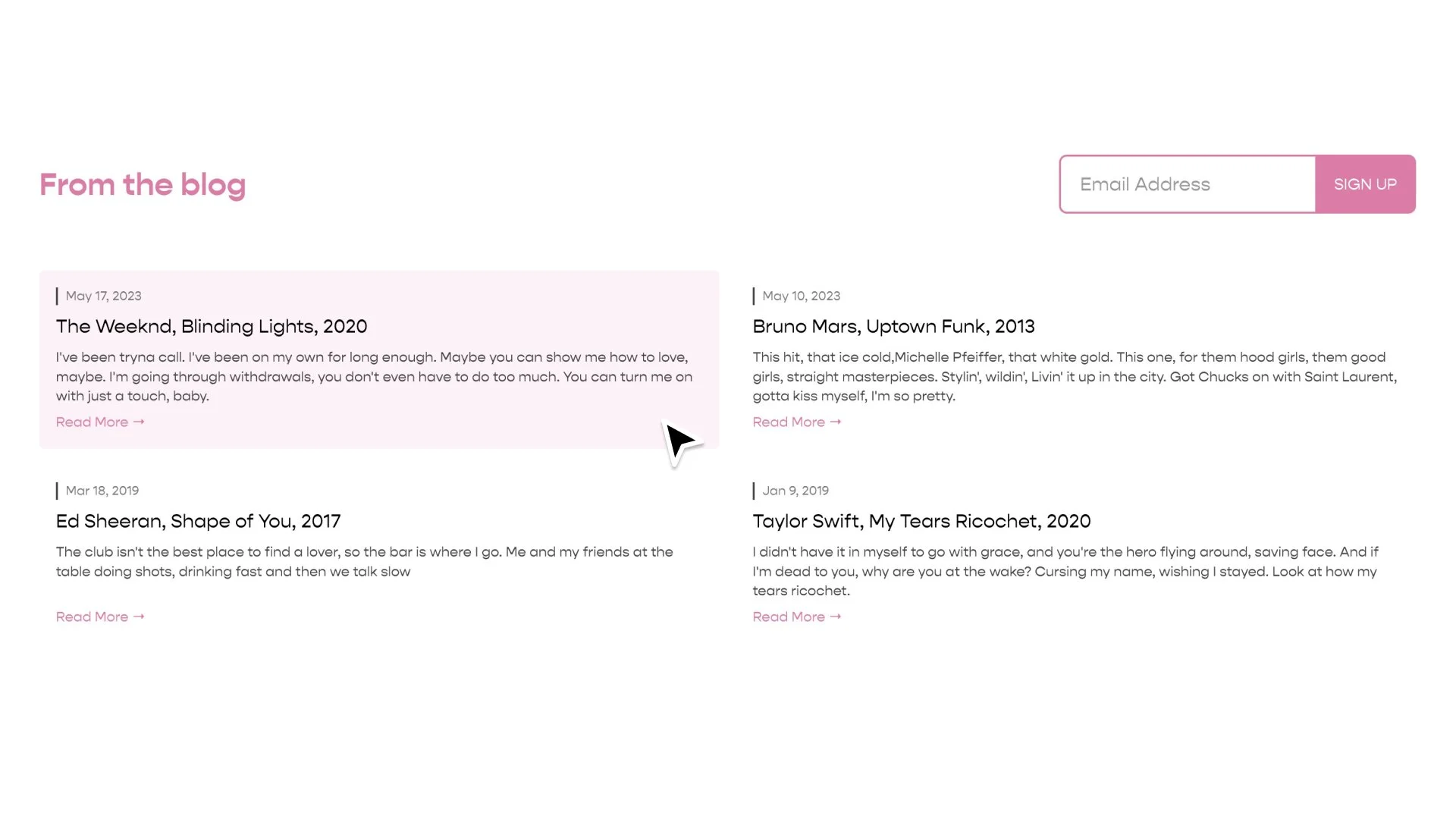
Summary Block Style #1 [for Grids]
This tutorial is simply a free style for your Grid Summary Blocks. There are a number of elements that you can customize, and I review each of these in the video below. Enjoy!
This code will transform all of the Summary Blocks on a website, that are using the “Grid” layout, into the 2 column grid design from above.
In the video above, I review all of the different items that you might want to adjust.
To target this code to one particular summary block, grab the block id, of that one summary block, and put all of the code below within the opening and closing curly brackets of that block id. The structure should look like this:
#block-id {
[CSS Code From Below Here]
}
.summary-block-setting-design-autogrid .summary-item-list{
  display:grid;
  grid-template-columns: 1fr 1fr;
  gap: 68px 17px;

  .summary-item{
    margin: 0 !important;
    width: auto !important;

    border-bottom:1px solid grey;
  }
  .summary-content{
    display:flex;
    padding-top: 17px;
    padding-bottom:8px;
  }

  .summary-title{
    flex-grow: 1;
    font-weight:100;
    text-transform:uppercase;
    transition: opacity .5s ease;
  }
  .summary-metadata-container{
    flex-basis: 12ch;
    flex-shrink:0;
    text-align:right;

    * {
      font-weight:100;
      text-transform:uppercase;
      color:black;
      opacity: 1;
    }
  }

  .summary-thumbnail-outer-container{
    a{
      margin-bottom:0px !important;
    }
    img{
      filter: grayscale(100%);
      transition: filter .5s ease,
        transform 1.5s ease;
      will-change: transform;
    }
  }

  /*Hover Effects*/
  .summary-item:hover {
    img{
      filter: grayscale(0%);
      transform: scale(1.05);
    }
    .summary-title{
      opacity: .5;
    }
  }

  /*Mobile Styles*/
  @media(max-width:599px) {
    grid-template-columns: 1fr;
    gap: 51px;

    .summary-thumbnail-outer-container{
      width:100vw;
      left:50%;
      margin-left:-50vw;
    }
  }
}
Using the Summary Block Editor, remove the "Primary Metadata" field that holds the date and center the text in the design tab. Then, in the code above, set the flex-basis value for the summary-metadata-container to 0.
.summary-metadata-container{
  flex-basis: 0;
}
Find Credit: Karen Herzog
Design Credit: Juul Frost Arkitekter
Related Code Snippets
The below Code Snippets are available to Code Curious members.

