Auto-Layouts for Squarespace 7.1 Explained
Squarespace Auto Layouts are now available as a new section-type for all Squarespace 7.1 websites. In this article, I’m going to review some of my favorite features, as well as point out the differences between the Auto Layout Banner Slideshow and my Pro Section Slider plugin. Let’s dive in.
Creating an Auto Layout Section
You create a new Auto Layout Section the same way you would a normal section. You can only add list section onto a page that allow for well, sections. So this includes any normal page you add, but doesn’t include product pages, blog pages, and event pages (Although the “Collection” page does work for each of these).
Currently, there are 26 different layout presets you can choose from. These are presets because each one has the same base features and can be adjusted in the same way (watch me adjust the layout in the video above). So just pick one and get started!
Adding List Items
Once you have a List Section on your page, you need to add in the List Items. You can edit each List Item on the Content tab of the section editor.
Here are some examples of what each item might be.
If you’re creating a list of product features, each feature would be a list item
If you’re creating a slideshow, each slide would be a list item
If you’re creating a logo carousel, each logo would be a list item
Each List Item can hold an image, a title, a description, and link. You also have the option of adding a Title and Button for the entire section.
Choosing a Layout
List Section Layout Options
You can choose from 3 different layout styles in the design tab.
Simple List
Banner Slideshow
Carousel
Each one of these is pretty cool and unique in its own right, so let’s dive into each one of these individually and talk about which situations each of these would be best used.
The Simple List
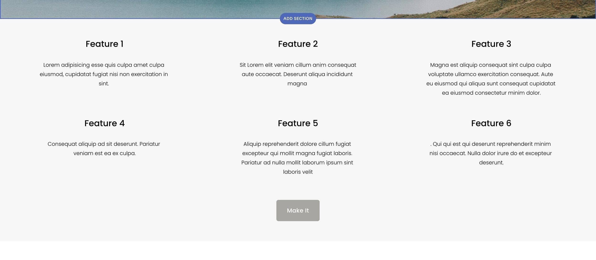
A Simple List using the List Section
The Simple List is best used when the list items should be the focus for the user. You might not be exactly sure what the user is looking for, so you place all of the items in an easy to see way.
Examples For a Simple List:
A list of features for a Product or Service
Testimonials - With focus on highlighting key messages
The Banner Slideshow
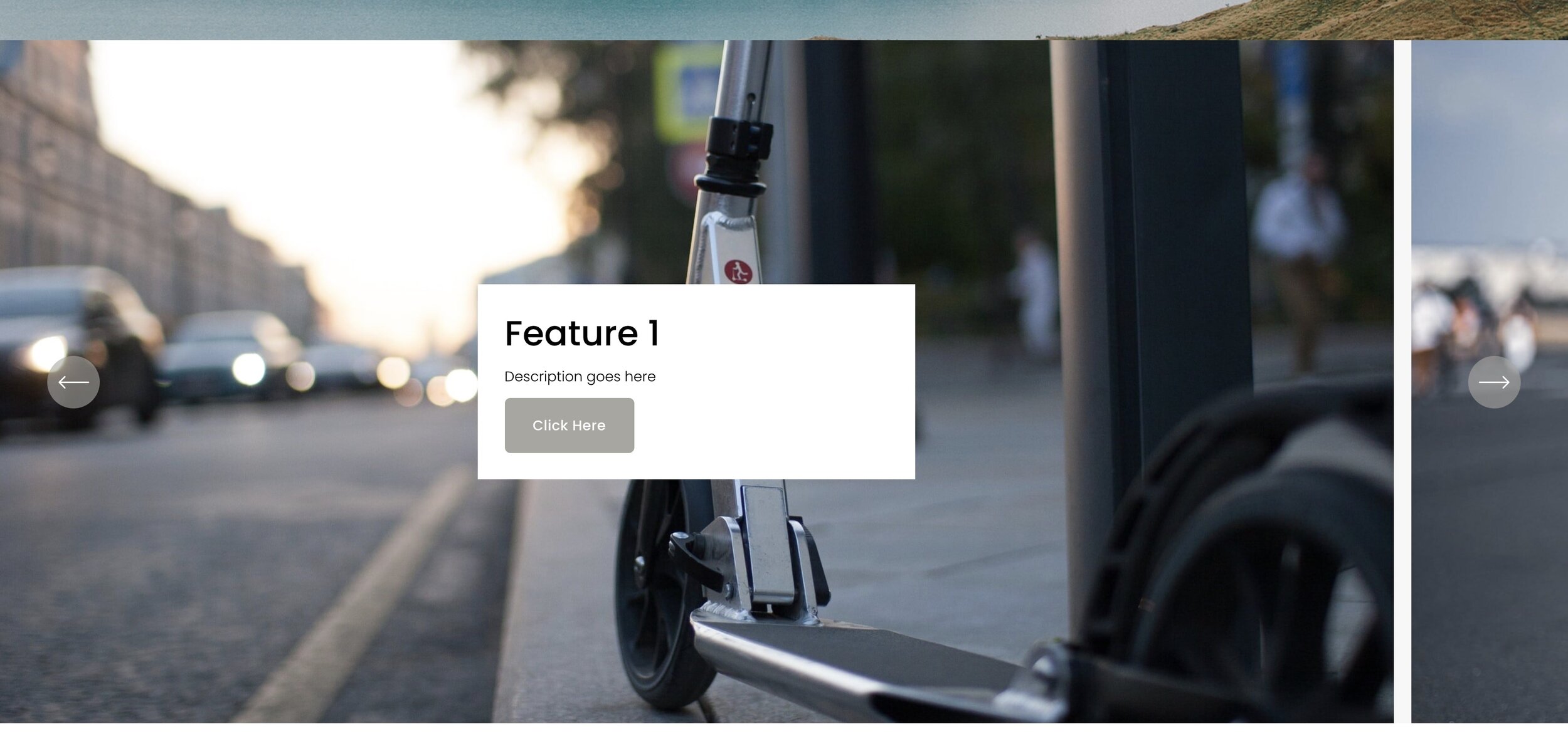
A Banner Slideshow using the List Section
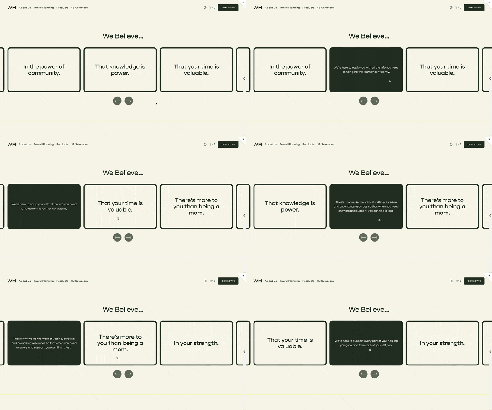
A Banner Slideshow is great when you want to focus the users attention to one specific thing. This is great for products, services, or portfolios with beautiful imagery. The first slide in a slideshow is important here, many people don’t move on to the next slide.
You also have the option for 'infinite scroll', which is pretty cool.
Examples For a Banner Slideshow
First Section of a Page highlighting the key messages of the page
To display the featured images in a collection of images
To display the featured videos in a Collection of videos
The Carousel
A Carousel using the List Section
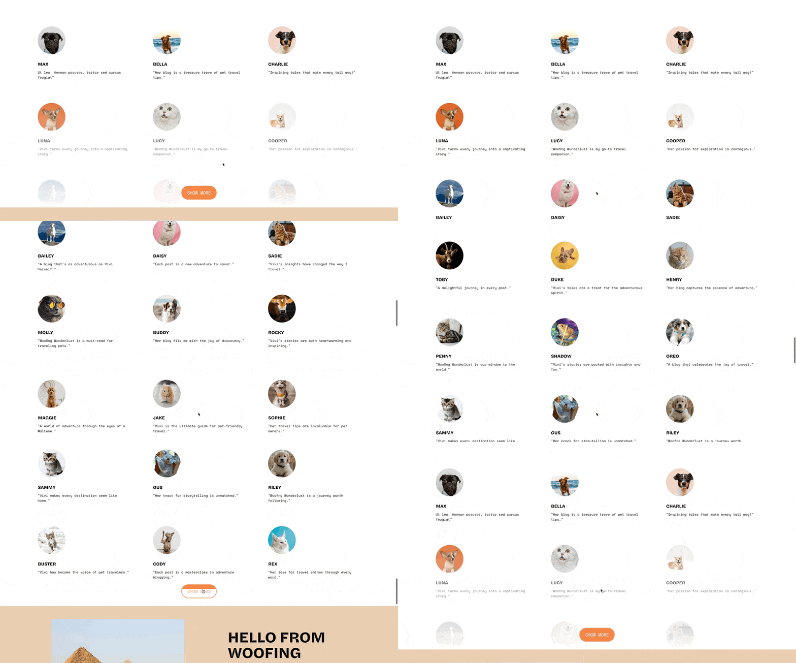
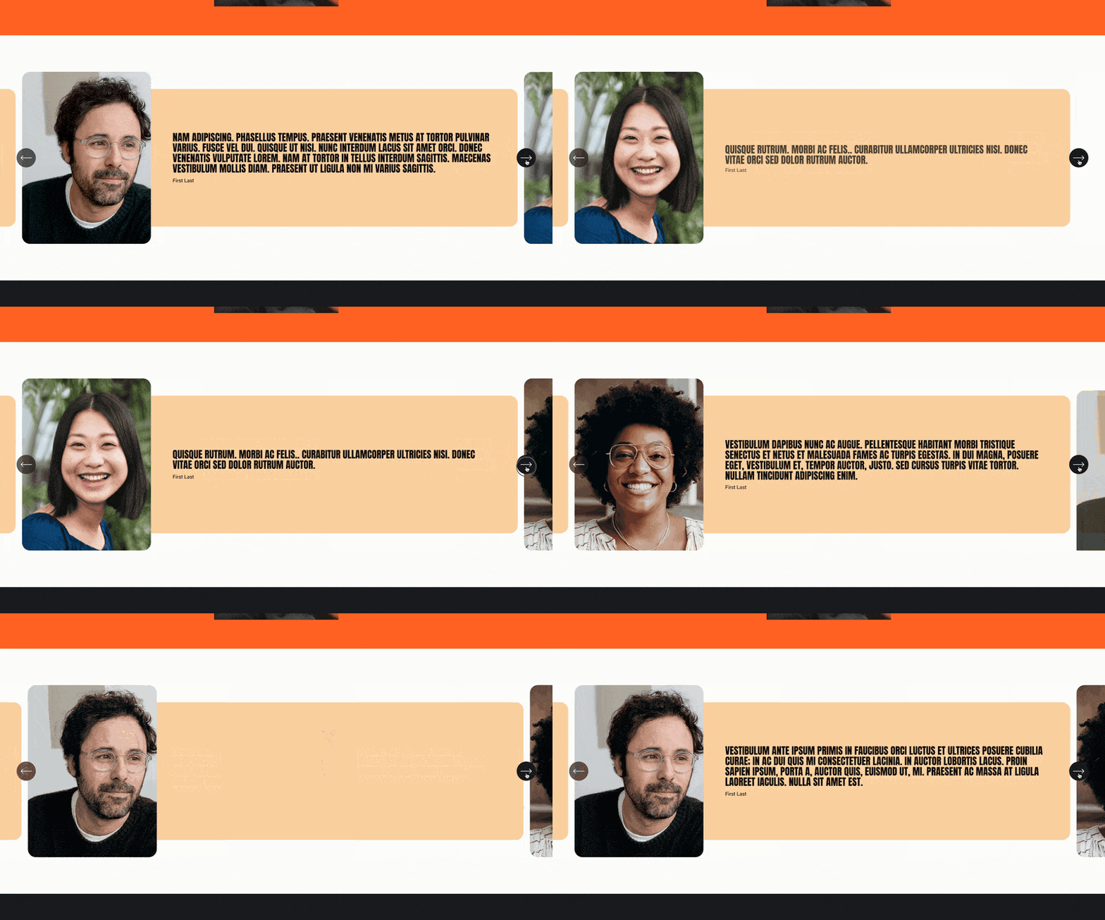
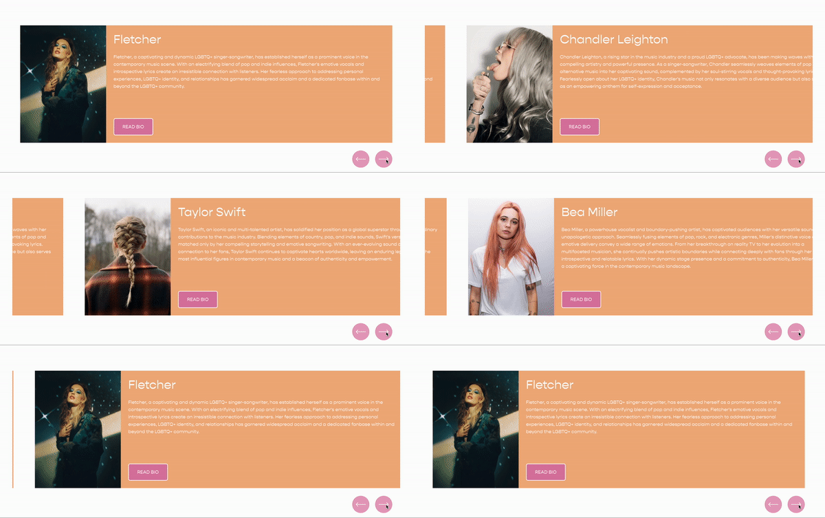
A carousel is great when the collection of items is the focus for the user as opposed to the simple list which focuses on the list. This is best used when vertical space is a concern, and your user might stop at this section and scroll through the items.
This layout also has the option to infinite scroll the items.
Examples For a Carousel
List of Team Members
Most Recently Published Articles
List of Testimonials - With focus on providing social proof
Limitations
There are a few limitations that I’ve found with this new section and so I thought I’d list them here.
Doesn’t pull in items from a blog / event / portfolio collection
Only simple text within each slide (no Custom HTML, videos, buttons, etc.)
No auto-scrolling
Related Code Snippets
The below Code Snippets are available to Code Curious members.


