
Same Height Summary Block Items

Article
In this tutorial, I’m going to go over how to make all the summary item’s for a blog post the same height, PLUS I’m going to go over how to make the first item full width while the rest stay in columns.
We’ll also be using a bit of CSS Grid, so if you’re curious about how to use that stick around.
The general idea of this tutorial is we’re going to change the structure of the parent container that is holding all of our grid items. Changing the display value of this container gives us a bunch of different options for layouts, and grid is the one we’ll want to be using today. Grid allows us keep all of our summary items, well, in a grid which gives us that clean box-like structure. Grid also gives us the ability to select certain items, like the first, and set specific widths of that item.
So here are the steps we’re going to take:
Apply Basic Styles to Summary Items
Turn The Summary Block into Grid
Making The Summary Block Responsive
Make the First Section Full Width
1. Apply Basic Styles
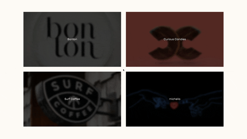
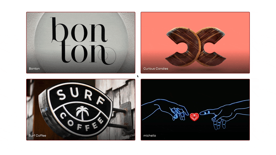
First add a summary block to your page and change it’s layout under ‘Design’ to ‘Grid’. Next let’s give our blog a few styles just to make sure we can see the changes that are happening and make it look a little nicer. We can select the .summary-item class and apply some basic formatting with box-shadow and background-color. We’ll also want to apply some padding around the container that holds the title, excerpt, and meta-data.
.summary-item{
  background-color:#f3f3f3;
  box-shadow: 0px 0px 5px #777;
}
.summary-content{
  padding:17px;
}
2. Turn The Summary Block Into Grid
Now we need to make the summary block a grid. All of our summary-items are siblings, meaning they all of the same direct parent container. And that parent container has a class of .summary-item-list. So if we change the display property of this element to display:grid, all of its children will take the values we set for that grid, initially these will just be default values.
.summary-item{
  background-color:#f3f3f3;
  box-shadow: 0px 0px 5px #777;
}
.summary-content{
  padding:17px;
}
.summary-item-list{
  display:grid
}
The default number of columns for Grid is 1, so that’s why each summary item is in its own row. But we can change the number of columns by using the grid-template-columns property.
.summary-item{
  background-color:#f3f3f3;
  box-shadow: 0px 0px 5px #777;
}
.summary-content{
  padding:17px;
}
.summary-item-list{
  display:grid;
  grid-template-columns: 250px;
}
We could set the column width to 250px, but that’s just one column. We could add another column at 250px like this:
.summary-item{
  background-color:#f3f3f3;
  box-shadow: 0px 0px 5px #777;
}
.summary-content{
  padding:17px;
}
.summary-item-list{
  display:grid;
  grid-template-columns: 250px 250px;
}
But this STILL doesn’t look right. The reason is because there are some styles that Squarespace is applying that we aren’t aware of so we need to over ride them.
The styles are being applied to our summary-item so we can override them in the CSS rule we’ve already started. We need to reset the margins, set the width to 100%, and override the inline styles using the !important flag.
.summary-item{
  background-color:#f3f3f3;
  box-shadow: 0px 0px 5px #777;

  width:100% !important;
  margin-right: initial !important;
  margin-bottom: initial !important;
  margin-left: initial !important;
}
.summary-content{
  padding:17px;
}
.summary-item-list{
  display:grid;
  grid-template-columns: 250px 250px;
}
Now we’re closer, but let’s add some spacing between each item using the super handy grid-gap property.
.summary-item{
  background-color:#f3f3f3;
  box-shadow: 0px 0px 5px #777;

  width:100% !important;
  margin-right: initial !important;
  margin-bottom: initial !important;
  margin-left: initial !important;
}
.summary-content{
  padding:17px;
}
.summary-item-list{
  display:grid;
  grid-template-columns: 250px 250px;
  grid-gap:17px;
}
Finally, we don’t want to set a fixed width for each column, we’d rather each column width be the same and take up as much space as the summary block has to offer. We do this through fractional units 1fr. This code will create two evenly wide columns in our grid.
.summary-item{
  background-color:#f3f3f3;
  box-shadow: 0px 0px 5px #777;

  width:100% !important;
  margin-right: initial !important;
  margin-bottom: initial !important;
  margin-left: initial !important;
}
.summary-content{
  padding:17px;
}
.summary-item-list{
  display:grid;
  grid-template-columns: 1fr 1fr;
  grid-gap:17px;
}
3. Making the Grid Responsive
The problem with setting these fractional units is that on mobile we’ll still only have 2 columns. We could use @media queries, but that’s unnecessary. I’ll just jump straight to the solution here, what we want to get to is this:
grid-template-columns:~'repeat(auto-fill, minmax(250px, 1fr))';.
This is allowing CSS Grid to choose the number of columns based on the width of it’s parent container. We use the squiggly line with the single quotes (starting and ending) in the Custom CSS area when want to process something as raw CSS, or put more nicely vanilla CSS. Code put in the Custom CSS area is processed through CSS LESS, so that squiggle line and opening and closing single brackets tells LESS to process everything within the single quotes as regular CSS.
Instead of explaining what that line of code above means, I think practicing it would be more beneficial. Each new CSS rule below takes you on a syntactic journey of how we got to ~'repeat(auto-fill, minmax(250px, 1fr))';
/*One Column at 250px*/
.summary-item-list{
  display:grid;
  grid-template-columns: 250px;
}

/*Two Columns at 250px*/
.summary-item-list{
  display:grid;
  grid-template-columns: 250px 250px;
}

/*Three Columns at 250px*/
.summary-item-list{
  display:grid;
  grid-template-columns: 250px 250px;
}

/*One column at full width*/
.summary-item-list{
  display:grid;
  grid-template-columns: 1fr;
}

/*Two columns each spliting the column width evenly*/
.summary-item-list{
  display:grid;
  grid-template-columns: 1fr 1fr;
}

/*Three columns spliting the column width evenly*/
.summary-item-list{
  display:grid;
  grid-template-columns: 1fr 1fr 1fr;
}

/*Six columns spliting the column width evenly*/
.summary-item-list{
  display:grid;
  grid-template-columns: ~'repeat(6, 1fr)';
}

/*Six columns spliting the column width evenly but with a minimum width of 250px*/
.summary-item-list{
  display:grid;
  grid-template-columns: ~'repeat(6, minmax(250px, 1fr))';
}

/*Let CSS Grid choose the number of columns based on the width of the container but with a minimum width of 250px*/
.summary-item-list{
  display:grid;
  grid-template-columns: ~'repeat(auto-fill, minmax(250px, 1fr))';
}
So here is our code now
.summary-item{
  background-color:#f3f3f3;
  box-shadow: 0px 0px 5px #777;

  width:100% !important;
  margin-right: initial !important;
  margin-bottom: initial !important;
  margin-left: initial !important;
}
.summary-content{
  padding:17px;
}
.summary-item-list{
  display:grid;
  grid-template-columns: ~'repeat(auto-fill, minmax(250px, 1fr))';
  grid-gap:17px;
}
4. Make the First Section Full Width
Now with that structure in place. We can specific certain summary items to span multiple columns if we want. First we need to select the first .summary-item element using our :nth-of-type() pseudo-class. Then apply this property, grid-column: 1 / -1. Now, I’ll be honest, explaining this is outside the scope of this article, but here is a great explanation, just look up the grid-column part. So here is our code now. Again, we’re using the notation to tell our Custom CSS area that this code is vanilla CSS.
.summary-item{
    background-color:#f3f3f3;
    box-shadow: 0px 0px 5px #777;

    width:100% !important;
    margin-right: initial !important;
    margin-bottom: initial !important;
    margin-left: initial !important;
  }
  .summary-content{
    padding:17px;
  }
  .summary-item-list{
    display:grid;
    grid-template-columns: ~'repeat(auto-fill, minmax(300px, 1fr))';
    grid-gap:2.5rem;
  }

  .summary-item:nth-of-type(1){
    grid-column: ~'1 / -1';
  }
Finally wrap all of that in the #id of the summary block, so that it’s not applied to everywhere throughout your website.
#summary-block-id{
  .summary-item{
    background-color:#f3f3f3;
    box-shadow: 0px 0px 5px #777;

    width:100% !important;
    margin-right: initial !important;
    margin-bottom: initial !important;
    margin-left: initial !important;
  }
  .summary-content{
    padding:17px;
  }
  .summary-item-list{
    display:grid;
    grid-template-columns: ~'repeat(auto-fill, minmax(300px, 1fr))';
    grid-gap:2.5rem;
  }

  .summary-item:nth-of-type(1){
    grid-column: ~'1 / -1';
  }
}
If you’ve enjoyed this article, consider signing up for my newsletter or buying me a coffee! Both in the footer below.
Best,
Will
Code
Add this to your Design » Custom CSS area
#summary-block-id{
  .summary-item{
    display:flex;
    flex-direction:column;
    background-color:#f3f3f3;
    box-shadow: 0px 0px 5px #777;

    width:100% !important;
    margin-right: initial !important;
    margin-bottom: initial !important;
    margin-left: initial !important;
  }
  .summary-content{
    flex-grow: 1;
    display:flex;
    flex-direction:column;
    padding:17px;
  }
  .summary-item-list{
    display:grid;
    grid-template-columns: ~'repeat(auto-fill, minmax(300px, 1fr))';
    grid-gap:2.5rem;
  }
  .summary-content .summary-read-more-link{
    margin-top:auto;
  }

  .summary-item:nth-of-type(1){
    grid-column: ~'1 / -1';
  }
}
OR Add this in a Code Block on the page or in Page Settings » Advanced » Page Header Code Injection area
    <style>
  #summary-block-id .summary-item{
    display:flex;
    flex-direction:column;
    background-color:#f3f3f3;
    box-shadow: 0px 0px 5px #777;

    width:100% !important;
    margin-right: initial !important;
    margin-bottom: initial !important;
    margin-left: initial !important;
  }
  #summary-block-id  .summary-content{
    flex-grow: 1;
    display:flex;
    flex-direction:column;
    padding:17px;
  }
  #summary-block-id .summary-content .summary-read-more-link{
    margin-top:auto;
  }

  #summary-block-id  .summary-item-list{
    display:grid;
    grid-template-columns: repeat(auto-fill, minmax(300px, 1fr));
    grid-gap:2.5rem;
  }

  #summary-block-id  .summary-item:nth-of-type(1){
    grid-column: 1 / -1;
  }
  </style>
Related Code Snippets
The below Code Snippets are available to Code Curious members.


