
Breakout Images on Narrow Blog in Squarespace 7.1
Breakout images aren’t available yet in Squarespace 7.1 blogs, but in this tutorial I show you how to get them back.
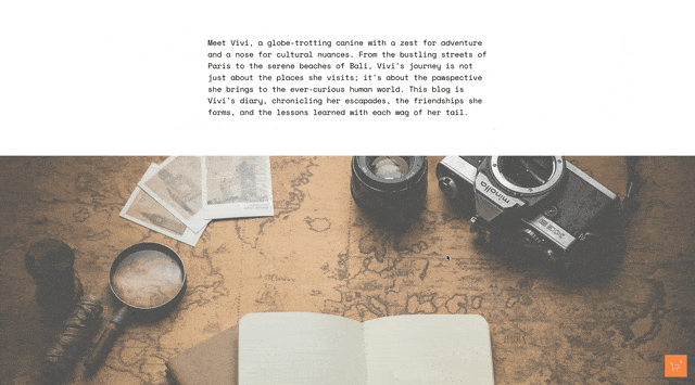
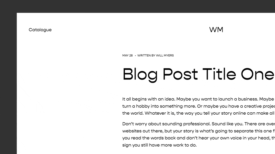
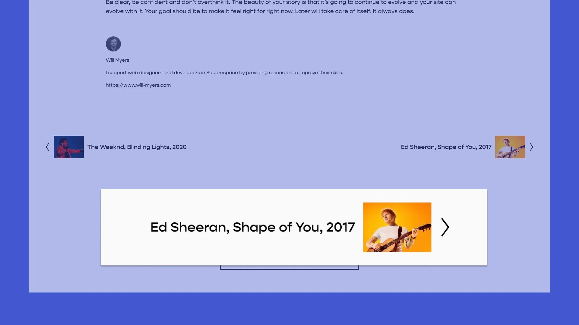
My blog here is set to narrow. I really like this layout because I’ve found that it’s much easier to read a paragraph when the text of the article isn’t wide. And being able to easily read an article is arguably the most important aspect of a blog. But one major drawback is that all of my images are stuck within the width that I set for my blog, which isn’t always what I want. Sometimes, it would be nice to have my images ‘breakout’ from a blog post. So let’s build it!
If you want to checkout some more tweaks you can make to blogs, check out my Blog Banner Header Images post.

You can set the width of your blogs to be narrow, medium, wide, or custom, but this constrains the width of all the content in the blog, including the images.
So here is what we’re going to do. In your Design » Custom CSS area:
1. Force the width of your blog to expand. We also need to add a max-width property
#sections .blog-item-inner-wrapper{
  width:100%;
  max-width:1500px
}
2. Constrain all Squarespace blocks. Feel free to change that width number to be whatever you want it to be. I like it set to 50% width. The margin: 0 auto centers the content on the screen.
#sections .blog-item-inner-wrapper .sqs-block{
  width:50%;
  margin: 0 auto;
}
3. Create the exceptions. This is where we’ll use the :not() pseudo-class to create exceptions on the style we added in step 2. I don’t want image blocks, video blocks, and gallery blocks to be unconstrained so I’ve added the classes for those elements within the :not() pseudo-class.
#sections .blog-item-inner-wrapper .sqs-block:not(.sqs-block-image):not(.sqs-block-video), .squarespace-comments{
  width:50%;
  margin: 0 auto;
}
4. Exceptions for rows. We also want to make exceptions for blocks that are added next to each other that create a row. So we need this CSS to make that happen.
#sections .blog-item-inner-wrapper .sqs-col-12 .sqs-row .sqs-block{
   width:100% !important;
   box-sizing: border-box;
}
5. Break on mobile. Wrap everything in a min-width media query so that these styles aren’t applied on mobile.
@media(min-width:799px) {
  #sections .blog-item-inner-wrapper{
    width:100%;
    max-width:1500px;
  }
  #sections .blog-item-inner-wrapper .sqs-block:not(.sqs-block-image):not(.sqs-block-video):not(.sqs-block-gallery), .squarespace-comments {
    width:50%;
    margin:0 auto;
  }
  #sections .blog-item-inner-wrapper .sqs-col-12 .sqs-row .sqs-block{
    width:100% !important;
    box-sizing:border-box;
  }
}
Code
Add this to your Design » Custom CSS area
@media(min-width:799px){
  #sections .blog-item-inner-wrapper{
    width:100%;
    max-width:1500px;
  }
 body:not(.style-3, .style-4) #sections .blog-item-inner-wrapper .sqs-block:not(.sqs-block-image):not(.sqs-block-video), .squarespace-comments{
    width:50%;
    margin:0 auto;
  }
  #sections .blog-item-inner-wrapper .sqs-col-12 .sqs-row .sqs-block{
    width:100% !important;
    box-sizing:border-box;
  }
}
Related Code Snippets
The below Code Snippets are available to Code Curious members.


