
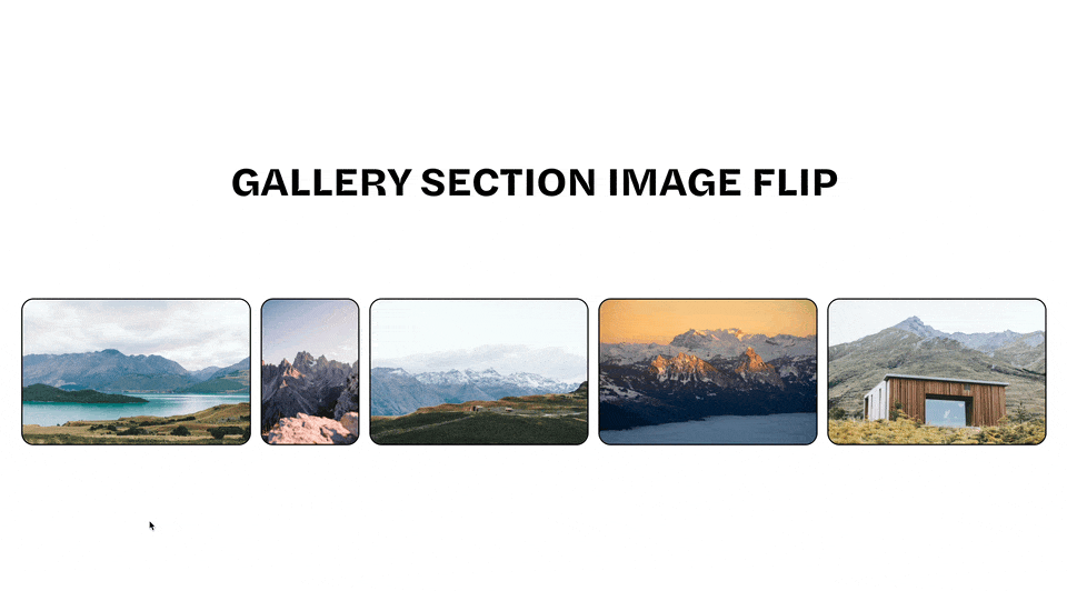
Prevent Cropping on Full Width Gallery Sections
Prevent cropping on your full width images within a gallery sections. In this tutorial, I’ll walk you making your gallery sections responsive through a single line of code.
Squarespace 7.1 websites only
Gallery Sections are only available on Squarespace 7.1 websites.
Add a new gallery section onto your page with some images. Be sure the gallery type is set to Slideshow: Full.
Copy and paste the below code snippet into your Design » Custom CSS area. Be sure to replace the data-section-id value with the specific data-section-id of your gallery section. Use this tool for help finding your section id.
In the clamp() function, the first value, 0px, is the minimum height the section can be. The second value, 56.25vw, is the preferred height of section — this is the value to adjust to set an aspect ratio. The last value is the maximum height the section can be.
I chose 56.25vw as our preferred height as that is the aspect ratio of a 16:9 image.
56.25vw comes from 9 divided by 16 multiplied by 100vw. Feel free to adjust this value to reflect the aspect ratio you want to maintain. For example:
4:3 aspect ratio = 75vw
2.4:1 aspect ratio = 41.67vw
/**
* Keep Aspect Ratio of Fullscreen
* Gallery Section Images
**/
section[data-section-id="123"] .gallery-fullscreen-slideshow {
  height: clamp(0px, 56.25vw, 85vh) !important;
}
Thanks to Sam Hancock, for letting me use his website as a reference in this tutorial.
Related Code Snippets
The below Code Snippets are available to Code Curious members.
