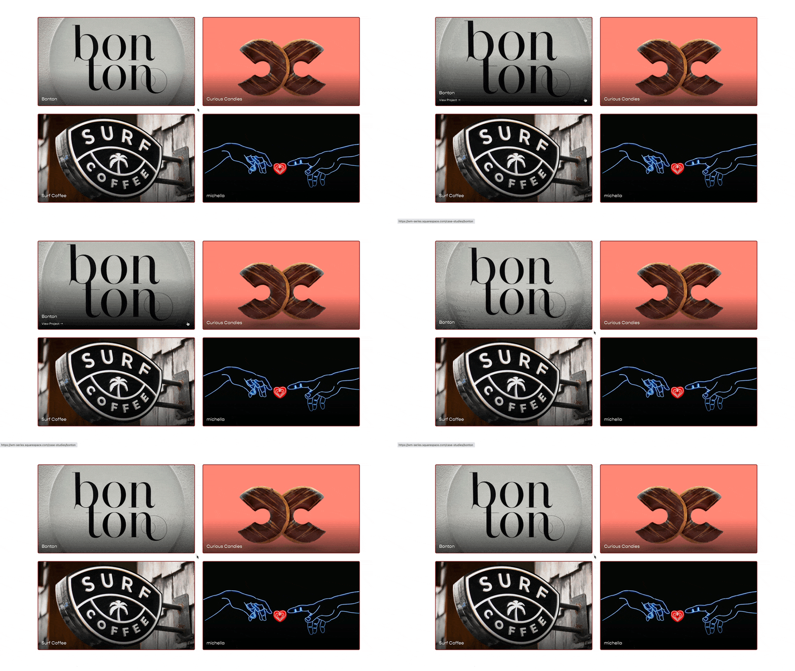
Targeting Image Blocks & Summary Images in Squarespace
In the most recent blast from the CSS-Tricks.com newsletter there was a link to this blog from Polypane.
There are some truly beautiful CSS transform examples with awesome hover effects. But this isn’t a tutorial on how to build these. This is a tutorial on how to use code someone else has shared on your website.
Finding and using CSS that others have shared is a key skill in becoming an expert web designer and developer. So in this tutorial. I’m going to show you how to apply the code, that Polypane has shared, to a few images in Squarespace, specifically, to Summary Block images & Image Block images.
Be sure to follow along with the process, and try to understand the why behind the code. This will help you become a better & faster coder/designer.
The process that I follow in the tutorial is one that I teach in my online course on CSS. If you’re interested in that course, just sign up for my newsletter, to stay up to date, the course is launching soon!
Selectors to target the Summary Block Image
.summary-thumbnail.img-wrapper{
   /*Add CSS Here*/
}
.sqs-block-image-figure .image-inset {
   /*Add CSS Here*/
}
If you’re applying styles and it’s not working, try adding the !important tag after the style before the semi-colon. This would force the style to be applied.
Related Code Snippets
The below Code Snippets are available to Code Curious members.


