
Split Screen Layout Design in Squarespace 7.1
Split Layout Designs are all the rage! Kinda. So let’s take a look at how to build a simple one here.
Want more advanced Split Layout Designs? Check out my Split Screen Layout Design Pack

Split Screen Layout with and image on one side and content on the other.
Note, this tutorial is for Squarespace 7.1 not 7.0.
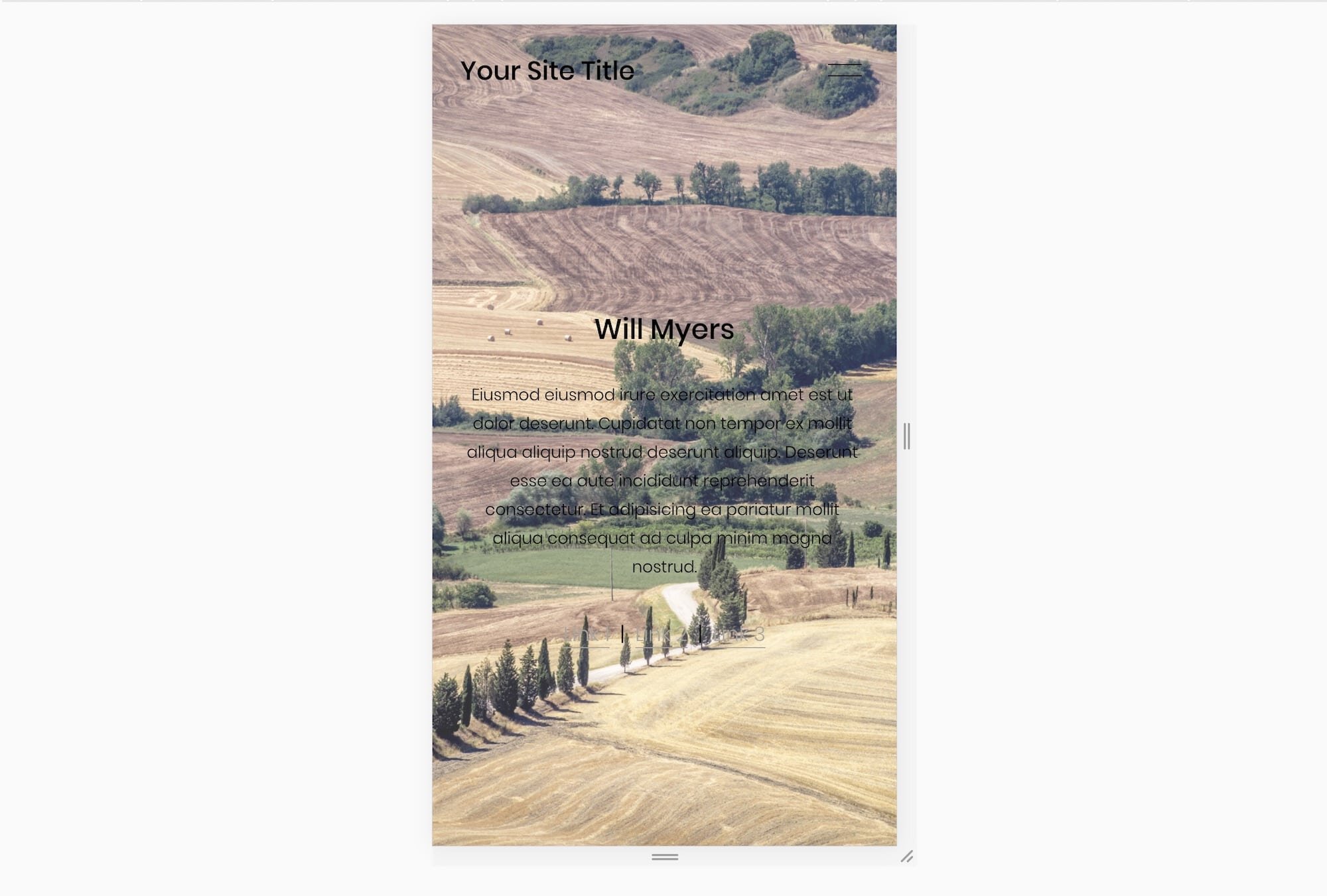
So first create a section on your page and add a background image with some content over it. This is what my page looks like when I just add in some stock imagery. It’s a difficult to read the text because of the contrasting color, but I’m not going to worry about that for now.

Now let’s go to school real quick and learn how Squarespace structures the HTML for each section. Every Section in Squarespace has two child elements. The first holds the section background, the second holds the section content. A stripped down version of the HTML looks like this:
<section data-section-id="123">
  <div class="section-background"></div>
  <div class="content-wrapper"></div>
</section>
Notice we have a parent element and two child elements. The content wrapper holds all of the content, while the section-background controls all of the background info (color, image, video). Because the section-background needs to fill up the entire section, Squarespace gives this element a position:absolute; property which allows the background to be behind the content. The Background is absolutely positioned in relation to it’s sibling element, the content-wrapper, not relatively positioned.
First we give each of these child elements (section-background and content-wrapper) a width of 50%.
.section-border{
  width:50%;
}
.content-wrapper{
  width:50%;
}
However, since we’re adding these to our Custom CSS area, these properties are being applied globally, to EVERY element with a class section-background and every element with a class content-wrapper. So, let’s find the data-section-id of the section we want to apply these properties too, and wrap around our current properties.
[data-section-id="ReplaceMe"]{
  .section-border{
    width:50%;
  }
  .content-wrapper{
    width:50%;
  }
}
Now, let’s use our margin properties to move these elements around. Margin properties apply outside space to our elements.
[data-section-id="ReplaceMe"]{
  .section-border{
    width:50%;
    margin-left:50%;
  }
  .content-wrapper{
    width:50%;
    margin-right:50%;
  }
}

The problem is, our content-wrapper element doesn’t seem to be changing. And that’s because another property is overriding the property we set. We can remedy this with the !important tag. I generally don’t like using this, because it makes debugging difficult, but for now, we’ll use it.
[data-section-id="RemoveMe"]{
    .section-border{
      width:50%;
      margin-left:50%;
    }
    .content-wrapper {
      width:50%;
      margin-right:50% !important;
    }
}
Next, we only want this to apply on desktop, because it looks to squished on mobile. You might be familiar with @media queries for styling things on mobile. We’re going to use a similar one, to style things just for desktop.
[data-section-id="RemoveMe"]{
  @media(min-width:767px){
    .section-border{
      width:50%;
      margin-left:50%;
    }
    .content-wrapper {
      width:50%;
      margin-right:50% !important;
    }
  }
}
This looks a bit better on mobile, but ideally, we’ll have the image not overlap with the text, but positioned above the text. So let’s add a mobile media query.
[data-section-id="RemoveMe"]{
  @media(min-width:767px){
    .section-border{
      width:50%;
      margin-left:50%;
    }
    .content-wrapper {
      width:50%;
      margin-right:50% !important;
    }
  }
  @media(max-width:767px){
    display:block;
    .section-border, .content-wrapper{
      position:relative;
    }
    .section-border{
      height:200px;}
  }
}
In this code, we’re giving the section element a property of display:block, and the section-background and content-wrapper elements a property of position:relative. (remember the section-background element had a property of position:absolute earlier). Then we shorten the height of the image to get the following result.

And for the final touch, let’s add a background color to the entire section. (Changing the background color in the section editor won’t work because that changes the background color of the section-background element)
[data-section-id="ReplaceMe"]{
  background-color:#ddd;
  @media(min-width:767px){
    .section-border{
      width:50%;
      margin-left:50%;
    }
    .content-wrapper {
      width:50%;
      margin-right:50% !important;
    }
  }
  @media(max-width:767px){
    display:block;
    .section-border, .content-wrapper{
      position:relative;
    }
    .section-border{
      height:200px;
    }
  }
}
But wait there’s more! I have a plugin that allows you to put two sections next to each other and edit them how you would normally edit sections. You can also have scroll-y subsections. Oh oh oh, and you can have a SLIDESHOW ON ONE SIDE! Check out this demo page showing you all the cool things you can have.
The Code
This code will place the image above the content on mobile.
[data-section-id="ReplaceMe"]{
background-color:#ddd;
  @media(min-width:767px){
    .section-border{
      width:50%;
      margin-left:50%;
    }
    .content-wrapper {
      width:50%;
      margin-right:50% !important;
    }
  }
  @media(max-width:767px){
    display:block;
    .section-border, .content-wrapper{
      position:relative;
    }
    .section-border{
      height:200px;
    }
  }
}
This code will have the image below the content on mobile.
  [data-section-id="ReplaceMe"]{
  background-color:#ddd;
  @media(min-width:767px){
    .section-border{
      width:50%;
      margin-left:50%;
    }
    .content-wrapper {
      width:50%;
      margin-right:50% !important;
    }
  }
  @media(max-width:767px){
    display:flex;
    flex-direction:column;
    .section-border, .content-wrapper{
      position:relative;
    }
    .content-wrapper{
      order: 1
    }
    .section-border{
      height:200px;
      order: 2;
      width: 100%;
    }
  }
}
Want More Split Screen Design Layouts?
I’ve built a plugin that allows for multiple different designs for your split screen layouts and easy editing. Check it out below!

Create split layouts and sticky sections on your website. Create a split layout design by turning entire sections into split blocks.