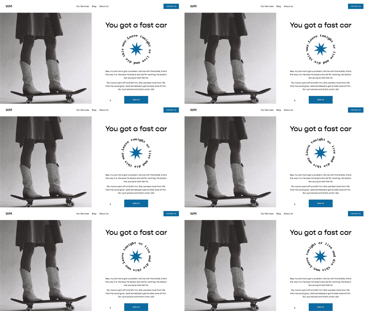
Adding Parallax in Squarespace 7.1
Ok, so before we jump toooo deep in, you should know this isn’t perfect parallax. I feel that true parallax will give you, the developer, complete control over how the parallax-ed image (is that word?) is displayed. This is css trick to give you parallax but you will for sure need to tweak this for each specific image you have.
So generally, here is how you do it.
HTML (Markup)
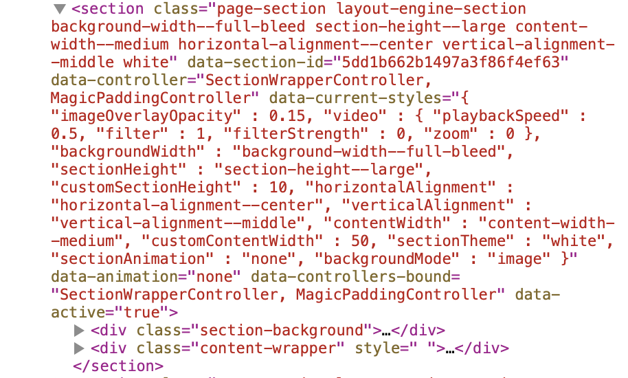
The html in Squarespace 7.1 is a bit different than it is in Squarespace 7.0. Each page is broken up into <sections> and each section has 2 main parts:
1) The Section Background
2) The Content Part
You can see this is reflected in this screenshot from a standard Squarespace 7.1 website.
A lot of the code in this you can ignore, so for simplicities sake, let’s remove all of the unnecessary code and simplify that data-section-id. This is the HTML we’ll be working with:
	<div class="section-background">
	</div>
    <<iv class="content-wrapper">
    </div>
</section>
The main CSS property that we’ll be working with is background-attachment:fixed; property.
.paralax(){
  content: "";
  background-size:cover;
  background-repeat:no-repeat;
  top: 0;
  left: 0;
  bottom: 0;
  right: 0;
  position: absolute;
  background-attachment: fixed;
  @media(max-width:787px){
    background-attachment: scroll !important;
  }
}

[data-section-id="123"]{
  .section-background{
    &::after {
      .paralax();
      background-image:url(image.png);
    }
  }
}
Optional CSS properties
.paralax(){
  opacity:.2;
  background-size: 65%;
  transform: translateZ(-1px) scale(1.2);

  content: "";
  background-size:cover;
  background-repeat:no-repeat;
  top: 0;
  left: 0;
  bottom: 0;
  right: 0;
  position: absolute;
  background-attachment: fixed;
  @media(max-width:787px){
    background-size:100% !important;


    background-position: -20vw 20vh !important;
    background-attachment: scroll !important;
  }
}

[data-section-id="123"]{
  .section-background{
    &::after {
      .paralax();
      background-image:url(image.png);


      background-position: 50vw 20vh;
      background-size:40%;
    }
  }
}
Related Code Snippets
The below Code Snippets are available to Code Curious members.


