
Blur a background image in Squarespace (and other fun effects)
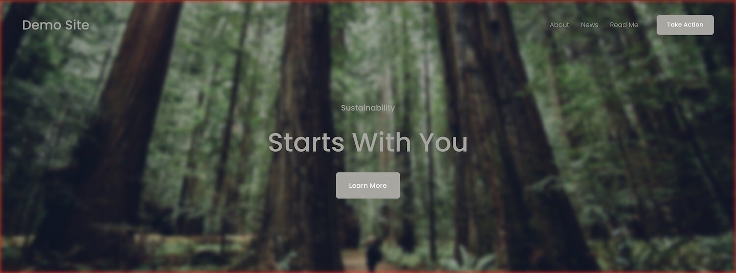
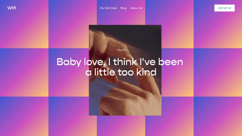
I have this cool blur effect on the demo page of my Slider that I thought I’d share. Basically it just adds a blur effect to an image, allowing you to do cool things like this:

The blurred background image (largest baby Yoda) is what I’m going to show you how to do. This tutorial will go over adding this effect in Squarespace 7.1, but if you’re on Squarespace 7.0, I have some code for you at the bottom.
Blurring an image is actually quite simple through CSS, all we need to use is the filter property.
This code is adding a filter to the mountain landscape image below it:
img{
  filter:blur(3px);
}
TRY IT OUT!
Change the pixel number in the code to see how it increases and decreases the blur effect. (0px = no blur)

Well that’s easy….
So what this CSS is doing is targeting the img element and applying a filter to that image with a value of blur(3px). You might have two questions after seeing this:
How can I target the right element?
What other values could I use instead of blur?
Targeting the background element
The background element of a section in Squarespace 7.1 can be targeted using the .section-background class. I visualize the HTML structure of a section in SS 7.1 like this:
[data-section-id]
.section-background
.section-content
The section is the outer (grey) box, and it contains the two inner (orange and blue) boxes. The first inner (orange) box holds the section background (.section-background) and the next box (blue) holds the section content (.content-wrapper). These two inner sections sit on top of each other. Hit that play button in the top right to see what I mean.
[data-section-id]
.section-background
.section-content
To target the background of a specific section, we first need to target the section, then that section’s background image.
Using the unique data-section-id of that specific section, I can blur the background with this bit of CSS added to our Page Header Code Injection area:
  <style>
  [data-section-id="UNIQUE ID"] .section-background{
    filter: blur(3px)
  }
  </style>
!! Be sure to switch out the UNIQUE ID text with the unique id of your specific section.
But wait! With some backgrounds, especially colored ones, we get this border around the image. Yuck.
So to get rid of this, just add a transform property with a scale value around 1.1 and adjust as necessary for your background. This will scale up your image so that that colored frame disappears. Your code should now look like this;
  <style>
  [data-section-id="UNIQUE ID"] .section-background{
    filter: blur(3px);transform: scale(1.1);
  }
  </style>
Did you notice?
We're applying this filter to the element, not the image. So this filter property can work for anything you want, not just section background images.
Once you do this, your background section will have a nice little blur effect. If you’re on a Squarespace 7.0 Brine template, scroll down to get code below.
What other values could I use instead of blur?
So why is the code filter:blur(3px) instead of blur:3px;, it’s because we have SO MANY FILTER EFFECTS!! Check out all of our options below:
blur()
brightness();
drop-shadow();
grayscale();
hue-rotate();
invert();
opacity();
saturate();
sepia();
You can also combine them if you want! So something like this would also work:
filter: blur(3px) grayscale(80%);
Best way to learn these is to play around with them, so check out this fun little codepen with a picture of my elderly dog, Hippity Hop, where you can play and adjust to your hearts content. The “Goodest Boy” filter is automatically turned all the way up on this one though.
See the Pen Hippy Filter by Will Myers (@Will-Myers) on CodePen.
If you’re interested in learning more about CSS in Squarespace, check out my Learn CSS in Squarespace course. This course is for people who are serious about their Squarespace Website building and want to level up their skills and/or grow their website building business. I wholeheartedly believe that CSS is the single best skill you can learn if you want to become a better Squarespace designer.
Code for Squarespace 7.0
Add this code the Index Page Settings » Advanced » Code Injection
  <style>
  #page-url .Index-page-image{
    filter:blur(3px);
    transform:scale(1.1);
  }
  </style>
Parallax in 7.0 Brine moves the background images around, so in this code, we’re targeting the element that holds the parallax images, then selecting the background of the specific section we want to target based on its order on the page. In this example, we’re targeting the FIRST background image on the index page.
Add this code the Index Page Settings » Advanced » Code Injection
  <style>
  .Parallax-host-outer .Parallax-item:nth-of-type(1) {
    filter:blur(3px);
    transform:scale(1.1)
  }
  </style>
Table of Contents
Related Code Snippets
The below Code Snippets are available to Code Curious members.


