
Polaroid Image Effect for Squarespace Image Blocks
Let’s add this polaroid Image Effect to Squarespace. Check out my video below to watch how I install it and for some fun tweaks to the images that you might like.

Polaroid Image Blocks In Squarespace
Code for Images in Classic Editor Sections
/*Image Block Polaroid Effect from Will-Myers*/
.design-layout-inline{
  padding: clamp(6px, 5%, 17px);
  padding-bottom: clamp(51px, 25%, 85px);
  background-color:hsla(0,0%,90%,1); /*background color*/
  border:2px solid;
  border-color: white hsla(0,00%,75%,1) hsla(0,0%,40%,1) hsla(0,0%,75%,1); /*border colors (top / right / bottom / left )*/
  background-image: url('data:image/svg+xml,%3Csvg xmlns="http://www.w3.org/2000/svg" width="8" height="8" viewBox="0 0 8 8"%3E%3Cg fill="%239C92AC19" fill-opacity="0.4"%3E%3Cpath fill-rule="evenodd" d="M0 0h4v4H0V0zm4 4h4v4H4V4z"/%3E%3C/g%3E%3C/svg%3E'); /*background pattern*/
  box-shadow: 0px 5px 5px hsla(0,0%,0%,.25) ,0px 5px 25px hsla(0,0%,0%,.20);
}
.design-layout-inline .image-block-wrapper{
  /* padding-bottom:90% !important; Adjusting the Image Aspect Ratio*/
}
.design-layout-inline img {
  top:0;
  left:0;
  height:100%;
  width:100%;
  object-fit:cover;
}
Code for Images in Fluid Engine
For this to work in fluid engine, be sure to set your image to “Fill” in the Image Blocks design tab
/*Image Block Polaroid Effect from Will-Myers*/
.design-layout-fluid{
  padding: clamp(6px, 5%, 17px);
  padding-bottom: clamp(51px, 25%, 85px);
  background-color:hsla(0,0%,90%,1); /*background color*/
  border:2px solid;
  border-color: white hsla(0,00%,75%,1) hsla(0,0%,40%,1) hsla(0,0%,75%,1); /*border colors (top / right / bottom / left )*/
  background-image: url('data:image/svg+xml,%3Csvg xmlns="http://www.w3.org/2000/svg" width="8" height="8" viewBox="0 0 8 8"%3E%3Cg fill="%239C92AC19" fill-opacity="0.4"%3E%3Cpath fill-rule="evenodd" d="M0 0h4v4H0V0zm4 4h4v4H4V4z"/%3E%3C/g%3E%3C/svg%3E'); /*background pattern*/
  box-shadow: 0px 5px 5px hsla(0,0%,0%,.25) ,0px 5px 25px hsla(0,0%,0%,.20);
}
How It Works
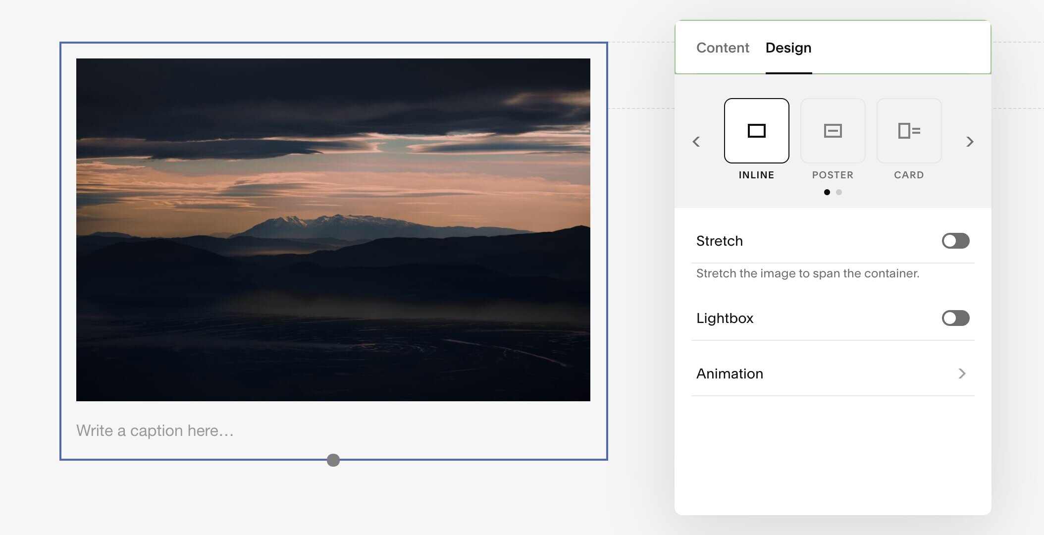
To get this effect working on your site, first add in an image block and make sure that the image block type is set to inline.
Adjusting the Image Block Type in Squarespace
Now, copy the CSS code from above and paste it into the DESIGN » CUSTOM CSS area of your website.
That’s it!
Now this effect will happen to every IMAGE BLOCK of type inline on your website.
But, let’s say you want to make some adjustments.
Changing the Image Block Type
To apply this effect to a different IMAGE BLOCK type, we need to adjust all 3 of the CSS classes, .design-layout-inline in our code above. There are 6 total IMAGE BLOCK types, including the one we’re currently using, so here are 5 other options you can use.
Poster: .design-layout-poster
Card: .design-layout-card
Overlap: .design-layout-overlap
Collage: .design-layout-collage
Stack: .design-layout-stack
Adjusting the Background Color & Pattern
There are two CSS properties effecting the background of the image. The background-color and the background-image.
The background-color can take any color value, HEX, COLORNAME, HSLA, etc.
There is also a faint pattern in the background of the image to give it a slight textured feel. This pattern is actually added using a data-uri of an SVG. Data-URI’s allow us to use SVG’s as images, pretty cool! To adjust the opacity of this pattern, you need to adjust the fill color, just like we would an SVG.
The fill color value right now is %239C92AC19. That %23 is actually just a #. So this value is really just a hex color value with an opacity value at the end - #9C92AC19.
That 19 tacked on at the end is the opacity value for a hex color. These two numbers are also int he hexidecimal format, so the 00 would be fully transparent and ff would be fully opaque.
Adjusting the Image Height
We’re using a little CSS Trick here to fix an aspect ratio of the image. The padding-bottom: 90% of the .image-block-wrapper determines the height of the image. This 90% is taken as a percentage of the width of the element.
A padding-bottom: 100% will be a perfect square since the width will equal the height.
A padding-bottom: 56.25% will be in the 9:16 aspect ratio.
A padding-bottom: 133% will be in the 4:3 aspect ratio.
Adjusting the Border Color
In my template, the border-color property takes 4 different values.
border-color: white hsla(0,00%,75%,1) hsla(0,0%,40%,1) hsla(0,0%,75%,1);
The first value, white, is the top border color.
The second value, hsla(0,0%,75%,1), is the right border color.
The third value, hsla(0,0%,40%,1), is the bottom border color.
The forth value, hsla(0,0%,75%,1), is the left border color.
Adjust these as you wish.
Rotate Effects
To rotate the image, you’ll need to add some extra code. Grab the unique Block ID of the specific block you want to rotate. Then, just add a transform property with a rotate() value.
  #block-id{
  transform: rotate(3deg);
}
Apply effect to one image
To do this, use a block-id. Follow my tutorial here if you’re curious about Block-ID’s in Squarespace.
Learn CSS in Squarespace
If you’re interested in learning more about CSS in Squarespace, check out my Learn CSS in Squarespace course. This course is for people who are serious about improving their Squarespace Website building skills. I wholeheartedly believe that CSS is the single best skill you can learn if you want to become a better Squarespace designer and would love to have you in the course.