
Switch the Logo When Mobile Menu is Open in Squarespace
Prevent your logo from clashing with the background color of your mobile menu. Use this quick CSS snippet to replace your logo when the mobile menu is open.
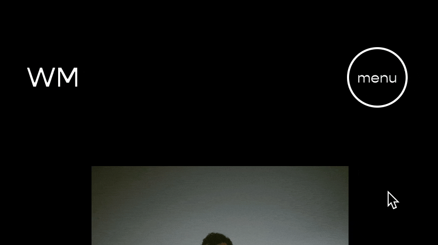
When a mobile menu is open, your logo might clash with the background color. In many cases, it might disappear completely!
Here is a little CSS Snippet to help you replace your logo with a different one (preferably one that doesn’t clash!), but only when the mobile menu is open.
Upload the logo you want to replace your current logo into the Design » Manage Custom Files area.
Paste this code into your Design » Custom CSS area.
Replace the value in the url() function with the url of your new logo.
/**
 * Replace Logo in Mobile
 * Menu When Open
 * from Will-Myers.com
**/
.header-title-logo a,
.header-mobile-logo a{
  position:relative;
  &:after{
    background-image:url();
    opacity:0;
    content:'';
    position:absolute;
    top:0;
    left:0;
    width:100%;
    height:100%;
    background-size:contain;
    background-repeat:no-repeat;
    background-position: center center;
    transition: opacity .3s ease;
  }

  body.header--menu-open &:after  {
    opacity:1;
  }
  body.header--menu-open & img  {
    opacity:0;
  }
}
Related Code Snippets
The below Code Snippets are available to Code Curious members.


