
Featured Product Layout for Product Pages in Squarespace
Here is a fun little design for a featured product on your products collection page in Squarespace.
Introduction
Squarespace Store pages are limited in their layout options.

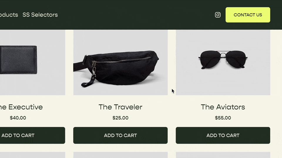
Bleh, boring ole store page.
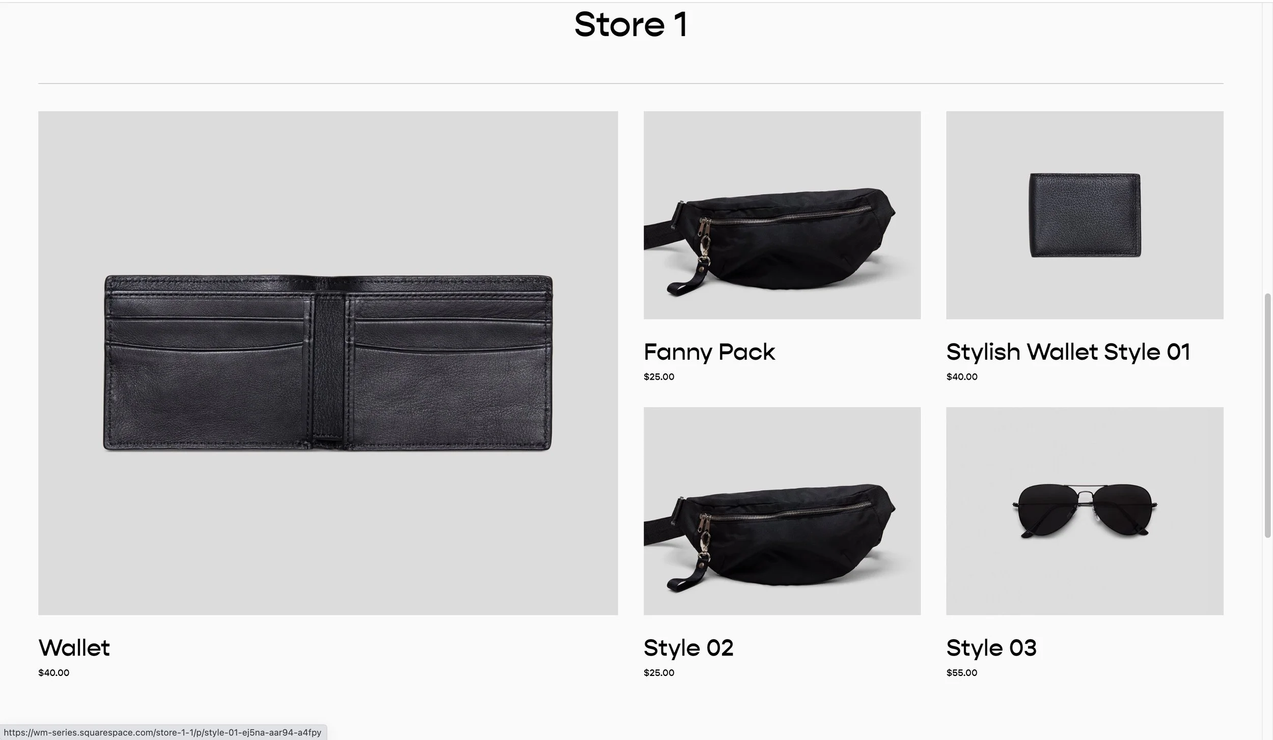
So let’s jazz it up a bit by making the first item twice as wide as the other items to draw some attention to it.
The Code
Here is the code for this layout. Simply paste the below CSS into your Design » Custom CSS area and the first item will become large.
This code snippet, as well as one for blog pages and many others, is available in the Code Catalogue.
/**
 * Product Page
 * Features Grid
 * From Will-Myers.com
**/
#page *:not(.ProductItem-relatedProducts) > .list-grid .grid-item:nth-of-type(1){
  @media(min-width: 767px) {
    grid-column: span 2;
    grid-row: span 2;

    .grid-item-link{
      position: relative;
      display: flex;
      flex-direction: column;
    }
    .grid-image{
      flex:1;
    }
    .grid-image-wrapper {
      padding-bottom:0;
      height:100%;
    }
  }
}
Note
Be sure products section has either 3 or 4 columns. This won’t work with 2 or less columns.
How does this work?
The product collection containers in Squarespace uses CSS Grid. This means that we can use grid properties on the items within the grid.
In the code above, I’m first targeting the first item in the grid using the :nth-of-type(1) pseudo selector. Also, since I don’t want this to apply to related products on a product page, I’m making sure the list-grid doesn’t have a direct parent of with a class ProductItem-relatedProducts.
#page *:not(.ProductItem-relatedProducts) > .list-grid .grid-item:nth-of-type(1){

}
Next we’re telling this first item to take up two columns and two rows within our Grid (These properties are only available because the parent container is using CSS grid).
#page *:not(.ProductItem-relatedProducts) > .list-grid .grid-item:nth-of-type(1){
  @media(min-width: 767px) {
    grid-column: span 2;
    grid-row: span 2;
  }
}
We also only want this style to take place on desktop. So I’ve added in a media query to make sure the CSS only gets applied when the screen width is larger than 767px.
Finally, within the media query, I’ve added in some additional CSS to override the images aspect ratio set in the section options so that it will fill up the available space.
.grid-item-link{
  position: relative;
  display: flex;
  flex-direction: column;
}
.grid-image{
  flex:1;
}
.grid-image-wrapper {
  padding-bottom:0;
  height:100%;
}
Hope you’re able to use this on a project! Reach out in the comments if you have any questions or enjoyed this code snippet.
Related Code Snippets
The below Code Snippets are available to Code Curious members.


