
Elegant & Interactive Pricing Section
Showcase your services or pricing with this interactive and elegant pricing section.
This code will turn a Simple List Section into an elegant pricing section with a nice scale effect.

How This Works
Last week, I received an email from Whitney Delany over at Delany Consulting (great web design & SEO services, btw). She had a pricing section on her website and wanted some help with making it feel a little bit more interesting and lively.
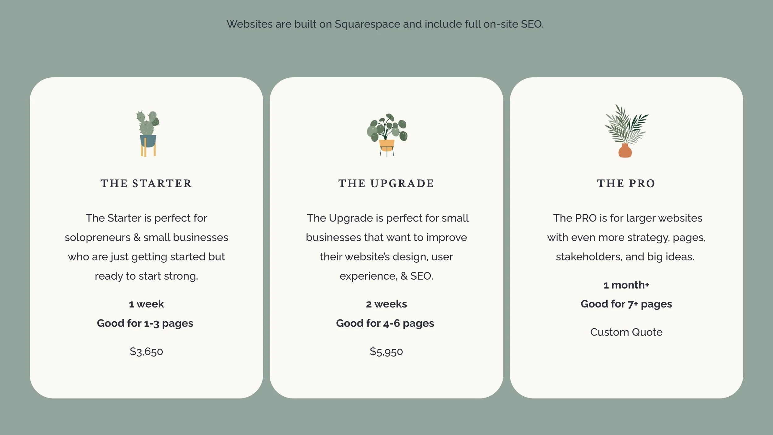
Pricing Section on Delany Consulting, before any changes.
This looks great, tbh, but there were some additional tweaks and hover actions that we could add that could really make this section pop.
Whitney’s idea was to add a hover effect on each pricing option that would scale that would scale it up. So I got to work,
shameless plug
Whitney is a member of my Code Curious membership and I occasionally take on free projects like this for members. Learn more.
Core Functions
There are three core functions that I thought would make this really pop.
Scaling up the list item on hover.
Fading out the other items when not hovering on them. (spotlight effect)
Keeping the middle item highlighted by default.
The Setup
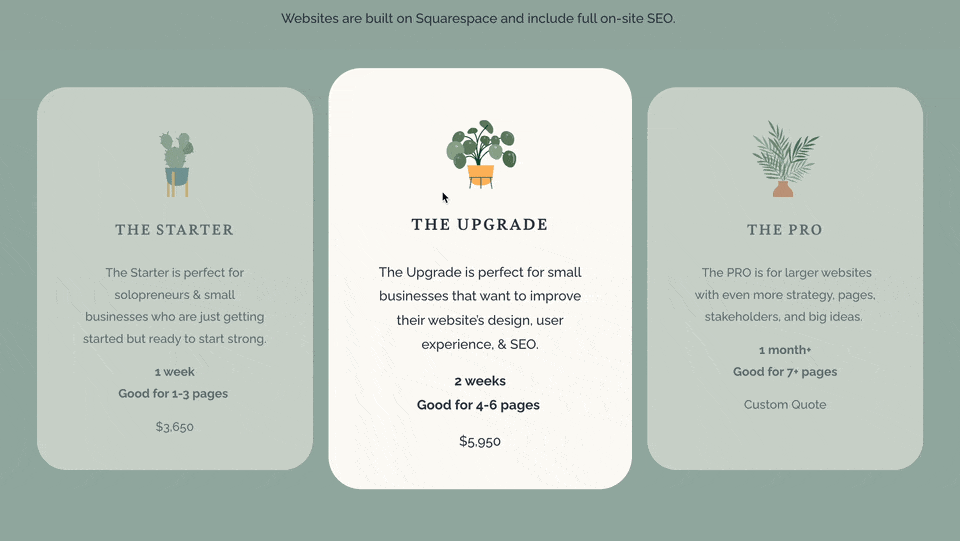
Whitney was using a normal Fluid Engine section for her pricing section, with stacked text, image, and shape blocks to create each pricing option. However, for this effect to work well, we needed to group our items together, not just layer them — and Fluid Engine doesn’t allow for grouping. So we switched to a List Section and used the List Section settings to create a similar looking section.

A list section with 3 pricing options, no custom code added yet.
Targeting
The above is built without any Custom CSS, and only playing around with the options in the List Section’s Design panel. But the rest of our style tweaks need to be done with Custom CSS.
To targeting each pricing options within the list section, we need to target the list items (<li>) elements within it’s container (<ul>). I was able to get those curved borders back by adding the following code to the Custom CSS area.
section[data-section-id="65f0a634280f8a284c74cdf9"] ul {
  li {
    border-radius: 40px;
  }
}
I first targeted the List Section’s unique data-section-id, using the free Squarespace ID Finder Chrome extension. Then the unordered list element (<ul>) inside this section.

Minimal CSS Added to the Section
Scaling up on hover
Next, I wanted to add the scaling up effect, on hover. With CSS, we can change the scale property (default is 100%) when targeting it’s hover state.
It’s always good practice to add a transition property to smooth out the scaling effect. Be sure to add the transition property on the stateless target, so that it scales larger and smaller smoothly.
section[data-section-id="65f0a634280f8a284c74cdf9"] ul {
  li {
    border-radius: 40px;
    transition: scale 0.3s ease;
  }
  li:hover {
    scale: 110%;
  }
}
Fading out other items
Next, it’d be great to spotlight the currently hovered item. And we can do this using a little bit of CSS trickery.
First we fade out all of the items when we hover over it’s parent container. In this case, the parent container is the <ul> element, which we can reference using the ampersand (&).
Then we can force the currently hovered list item to not be faded out.
section[data-section-id="65f0a634280f8a284c74cdf9"] ul {
  li {
    border-radius: 40px;
    transition: scale 0.3s ease,
      opacity 0.3s ease;
  }
  // Fade out all list items when we hover over the container
  &:hover li {
    opacity: 0.5;
  }
  // force the
  li:hover {
    scale: 110%;
    opacity: 1;
  }
}
I’ve also added an additional value for the opacity onto our transition property, separated with a comma.
Highlight the middle item
Lastly, let’s make the middle item scaled by default. To do this, we need to scale the middle (2nd) item if we’re not hovered over the container (<ul>).
section[data-section-id="65f0a634280f8a284c74cdf9"] ul {
  li {
    border-radius: 40px;
    transition: scale 0.3s ease,
      opacity 0.3s ease;
  }
  &:not(:hover) li:nth-child(2) {
    scale: var(--hover-scale, 105%);
  }
  &:hover li {
    opacity: 0.5;
  }
  li:hover {
    scale: 110%;
    opacity: 1;
  }
}
Final Tweaks
Finally, we need to make sure this doesn’t works on mobile phones or tablets — the effects can get a bit wonky on them. So we’re going to wrap our interactivity CSS in some media queries that restrict them from applying on smaller and touch devices.
I’ve also added some !important tags, which I don’t typically like to do, in order to override any Global Animations Squarespace might have added.
section[data-section-id="123"] ul {
  li {
    transition: scale 0.3s ease,
      opacity 0.3s ease;
    transition-delay: 0s !important;
  }
  @media(min-width: 767px) and (hover:hover) {
    // Remove the following 3 lines to prevent the scaling of the second item
    &:not(:hover) li:nth-child(2) {
      scale: 110%;
    }
    &:hover li:not(:hover) {
      opacity: 0.7 !important;
    }
    li:hover {
      scale: 110%;
      opacity: 1 !important;
    }
  }
}
And that’s it! Now we have a fun and interactive pricing section that pops!
Installation
Directions:
Add a List Section with the Design set to Simple List.
Paste the CSS below into your Custom CSS area.
In the CSS, replace the data-section-id="123" with the specific data-section-id of your List Section (use the Squarespace ID Finder tool to find the data-section-id)
Adjust the --hover-scale and --hover-opacity values to your liking.
Styles
Place this in your Custom CSS area.
/**
* Elegant Pricing Section
* On Page ********
* From Will-Myers.com
**/
section[data-section-id="123"] ul {
  --hover-scale: 110%;
  --hover-opacity: 0.5;
  li {
    border-radius: 40px;
    border-width: 0px;
    border-style: solid;
    border-color: black;
    transition: scale 0.3s ease,
      opacity 0.3s ease;
    transition-delay: 0s !important;
  }
  @media(min-width: 767px) and (hover:hover) {
    // Remove the following 3 lines to prevent the scaling of the second item
    &:not(:hover) li:nth-child(2) {
      scale: var(--hover-scale, 105%);
    }

    li:hover {
      scale: var(--hover-scale, 105%);
    }
    &:hover li:not(:hover) {
      opacity: var(--hover-opacity, 0.7) !important;
    }
  }
}
Related Code Snippets
The below Code Snippets are available to Code Curious members.


