
Building a Vertical Timeline Component in Squarespace
Create a beautiful looking vertical timeline (or process) component, from scratch, in Squarespace.
It’s hard to make a tax website exciting, but somehow, Jay did it. The only problem was, that the design called for a number of custom components that weren’t native to Squarespace.
One such component was a Vertical Timeline component. Well, it wasn’t really a timeline, more of an onboarding process, but the general structure was the same.
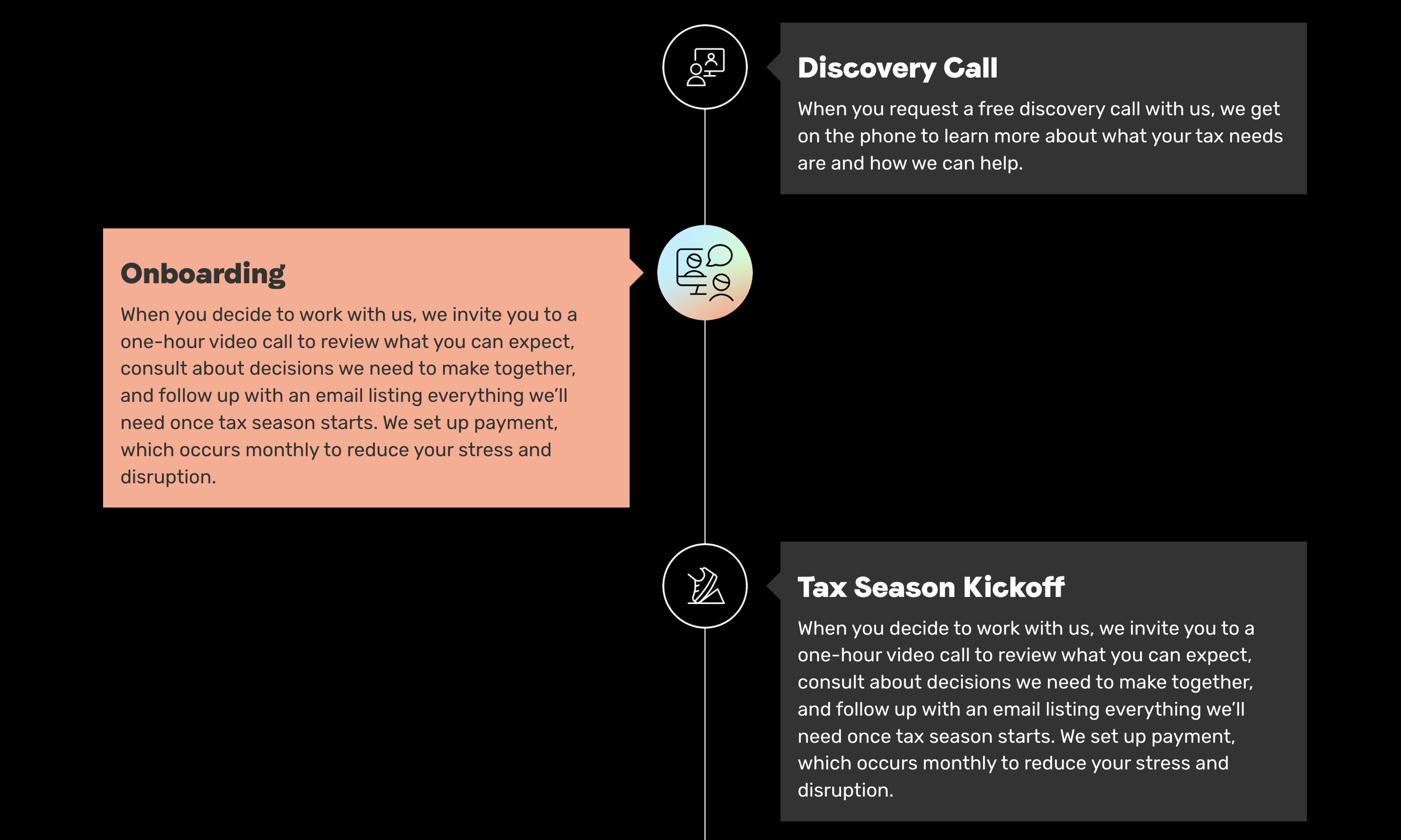
The design called for:
The Timeline Line - The vertical bar straight down the center of the component.
Dots - Visual interest on the Timeline Line that indicates each step in the process
Events - A title and description for each of step
Alternating Layout - A layout where each step sat on alternating sides of the timeline.
In today’s tutorial, we’ll build out a similar timeline component to the one above. However, in our iteration, we’ll add dates and replace the images with dots.

Vertical Timeline Plugin
For the power-user or no-code user, I’ve created a Vertical Timeline plugin that creates a timeline from a blog collection. Use the no-code builder to design your vertical timeline and copy and paste the generated code into your website. This plugin allows for images and multiple style configurations. Check it out here.
Pieces of a Timeline
The first thing to do when building out a custom component is to create the HTML. As you start adding CSS to build the layout, you might revise this HTML structure a few times, and that’s ok. I’ll spare you the revision cycles and just jump to what I’ll be using in this tutorial.
Here is what I used.
<!-- [1] -->
<div class="timeline">

  <!-- [2] -->
  <div class="timeline-item">

    <!-- [4] -->
    <div class="timeline-dot"></div>
    <!-- [5] -->
    <div class="timeline-card">

      <!-- [6] -->
      <h3>Timeline Item 1</h3>
      <p>Jan 1, 2023</p>
      <p>This is my description for the timeline card. <a href="#">Read More</a></p>
    </div>
  </div>
  <!-- More Timeline Events-->

  <!-- [3] -->
  <div class="timeline-line"></div>
</div>
The Timeline Container - this will hold the entire timeline. Contains all the timeline events and the Timeline Line
The Timeline Events - A single event on the time. This holds all the information in a timeline event. Repeats for as many events as needed
The Timeline Line - The vertical bar that spans the height of the timeline
The Timeline Dot - The dot that sits on the timeline indicating the events placement in time.
The Event Card - The container that holds all of the content within the timeline
The Event Content - the content that describes the event, including the title, date and description.
If we just paste this into a Code Block right now, it’ll look like this.

I’ve used just generic text for my headers, dates, and descriptions, but now would be the time to jump in and adjust the text to what you want. Feel free to omit the date if you want to build a process instead of a timeline.
Styling the Timeline
Once it’s all in place, we need some CSS to create the layout. There is a lot going on in the code, but here are the highlights:
I’ve used position:absolute to position the .timeline-line & .timeline-dot visually in the center.
I’ve set the width of the the .timeline-card (not the .timeline-item) to be 47% instead of 50% to allow for spacing around the timeline line.
I’ve used .timeline-item:nth-child(odd) to target every other item and then targeted the .timeline-card within it. This allowed me to position it on the right side.
.timeline {
  position: relative;
  display: grid;
  gap: 17px;
}

.timeline-line {
  position: absolute;
  height: 100%;
  width: 4px;
  background: black;
  top: 0;
  left: 50%;
  transform: translateX(-50%);
}

.timeline-card {
  position: relative;
  background: white;
  width: 47%;
  padding: 17px;
  box-sizing: border-box;
  border-radius: 5px;
}

.timeline-item:nth-child(odd) .timeline-card{
  left:53%;
}

.timeline-dot{
  position:absolute;
  left:50%;
  transform: translateX(-50%);
  width: 10px;
  height:10px;
  background: black;
  border-radius: 50%;
  z-index:1;
  border: 4px solid white
}
Now this should be looking a lot more like a timeline. A poorly designed one, sure, but a timeline nonetheless.

Coloring
In order to get the coloring correct, I’m going to match the color scheme Squarespace uses for each section.
Squarespace uses the following CSS Custom Properties (Variables) to color specific components:
var(--tweak-text-block-background-color) - The background color of a text block, when the Block Background toggle is turned on.
var(--tweak-heading-medium-color-on-background) - The color for h3 text, when the Block Background toggle is turned on.
var(--tweak-paragraph-medium-color-on-background) - The color for paragraph text, when the Block Background toggle is turned on.
In our CSS, among other styles, we can utilize the values like this:
.timeline-card {
  background: var(--tweak-text-block-background-color);
}
h3 {
  color: var(--tweak-heading-medium-color-on-background);
}
p {
  color: var(--tweak-paragraph-medium-color-on-background);
}
In the video for this tutorial, I didn’t use all the correct color properties to make the component perfectly match the color theme. However, the full and correct color matching is in the final code below.
Mobile Styling
On mobile, our layout maintains the same alternating events, which looks terribly scrunched. So, let’s add some mobile styles that disables the alternating effect, and pushes the vertical timeline to the left.
@media(max-width: 767px) {
  .timeline-line {
    transform: unset;
    left:7px;
  }
  .timeline-dot {
    transform: unset;
    left:0%;
  }
  .timeline-card{
    width: 90%;
    left: 10%;
  }
  .timeline-item:nth-child(odd) .timeline-card{
    left:10%
  }
}
Hover Effects
And finally, let’s add a little pizazz to our component where the items animate a little as we hover over them.
.timeline-card {
  box-shadow: 3px 3px 8px hsla(0, 0%, 0%, 0.1);
  transition: box-shadow 0.3s ease, transform .3s ease;
}
.timeline-card:hover {
  transform: translateY(-5px);
  box-shadow: 5px 5px 8px hsla(0, 0%, 0%, 0.14);
}
And that’s it, we have a custom built vertical timeline. Let me know if you have any questions or thoughts in the comments below.
Final Code
<div class="timeline">

 <!-- Repeat for More Timeline Events-->
  <div class="timeline-item">
    <div class="timeline-dot"></div>
    <div class="timeline-card">
      <h3>Timeline Item 1</h3>
      <p>Jan 1, 2023</p>
      <p>This is my description for the timeline card. <a href="#">Read More</a></p>
    </div>
  </div>
  <!-- Repeat for More Timeline Events-->

  <div class="timeline-line"></div>
</div>
/***
* Custom Timeline Component
* From Will-Myers.com
***/
.timeline {
position: relative;
display: grid;
gap: 17px;
.timeline-line {
position: absolute;
height: 100%;
width: 4px;
background: var(--tweak-text-block-background-color);
top: 0;
left: 50%;
transform: translateX(-50%);
}
.timeline-card {
position: relative;
background: var(--tweak-text-block-background-color);
width: 47%;
padding: 17px;
box-sizing: border-box;
border-radius: 5px;
box-shadow: 3px 3px 8px hsla(0, 0%, 0%, 0.1);
transition: box-shadow 0.3s ease, transform .3s ease;
}
.timeline-card:hover {
transform: translateY(-5px);
box-shadow: 5px 5px 8px hsla(0, 0%, 0%, 0.14);
}
.timeline-item:nth-child(odd) .timeline-card{
left:53%;
}
.timeline-dot{
position:absolute;
left:50%;
transform: translateX(-50%);
width: 10px;
height:10px;
background: var(--tweak-heading-medium-color-on-background);
border-radius: 50%;
z-index:1;
border: 4px solid var(--tweak-text-block-background-color);
}
//Text Colors
h1, h2, h3, h4 {
color: var(--tweak-heading-medium-color-on-background);
}
p {
color: var(--tweak-paragraph-medium-color-on-background);
}
//Mobile Timeline Styles
@media(max-width: 767px) {
.timeline-line {
transform: unset;
left:7px;
}
.timeline-dot {
transform: unset;
left:0%;
}
.timeline-card{
width: 90%;
left: 10%;
}
.timeline-item:nth-child(odd) .timeline-card{
left:10%
}
}
}Vertical Timeline Plugin
If you’d like a no-code way to create and install a Vertical Timeline component, try my Vertical Timeline Plugin. It pulls in the content from a Blog, so no need to adjust things in the HTML, and there are dozens of styling options.

Create a beautiful Vertical Timeline component to add to your Squarespace website with this simple plugin. Customize the styles and settings to match the brand of your website, and then copy and paste the generated code into your website.