

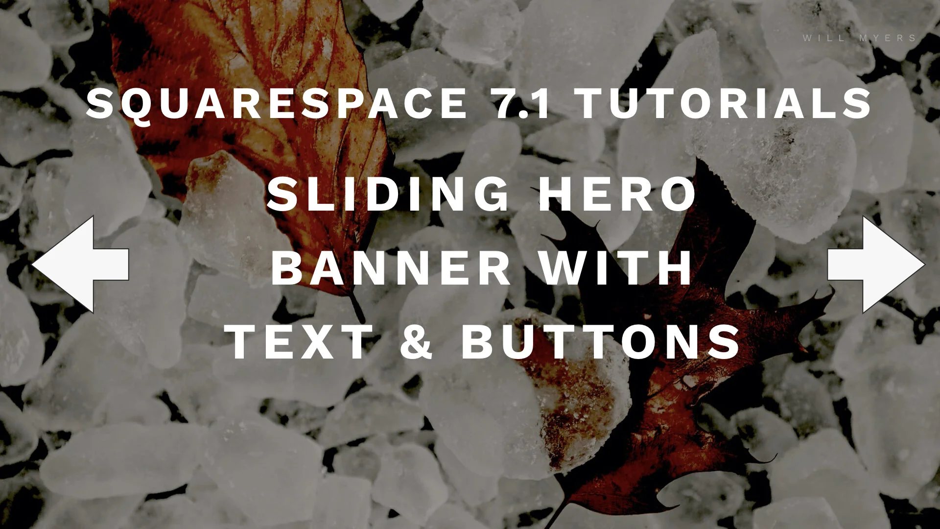
Image Slider with Text & Buttons
Squarespace 7.1 Tutorial
In this tutorial, I’m going to walk through installing the code necessary to make a full-weight, full-width, sliding image banner that you can put text on top of.
Watch the Video
But Do You Really NEED An Image Slider?
In general, I’m not really a big fan of image sliders especially at the top of a webpage.
Fake Button
Will's Web Stuff Newsletter
Get updated monthly-ish on all the new Squarespace Tutorials and explainer videos that I’ve created or found useful.
Squarespace 7.1 still doesn’t have the background image slider. So in this tutorial, I’m going to walk through installing the code necessary to make a full-weight, full-width, sliding image banner that you can put text on top of. I’ve taken the base of this code here from W3Schools and adjusted it for Squarespace 7.1.
In general, I’m not really a big fan of image sliders especially at the top of a webpage. The top of your webpage should be reserved for the single most important part of that page, not multiple. It’s also really easy for a guest to miss that it’s a slider. But with all that being the case, many people still like sliders like this, so whatcha gonna do?
Psst: As a challenge, try combining this effect with the parallax effect for a background image.
STEP 1
Create A New Page
Delete all content
Remove Background Image
Section Height = medium or small NOT Large
Section Width = Large NOT medium or small
Add in code block
Delete all other blocks
Step 2
Add HTML
Copy and paste from below
Swap our <img> url’s.
Adding other elements you want, <h1> <p> <button>
Step 4
Add CSS
Paste in the CSS Snippets from below
Change Section ID
Change Code Block ID
Code Snippet
HTML
<!-- Slideshow container --> <div class="slideshow-container"> <!-- Full-width images with number and caption text --> <div class="mySlides fade"> <img src="https://images.unsplash.com/photo-1579067049363-125ebfbfcf79?ixlib=rb-1.2.1&ixid=eyJhcHBfaWQiOjEyMDd9&w=1000&q=80" style="width:100%"> <div class="text-containter"> <h1> Image Slider with Text in Squarespace 7.1 </h1> <h2> Slide 1 </h2> <p> Ullamco esse in ipsum Lorem qui nisi quis cillum ut est. Eu consequat aute laboris ut sint et aute incididunt consectetur voluptate nulla anim irure eiusmod. </p> <a href="" class="sqs-block-button-element--medium sqs-block-button-element"> Learn more </a> </div> </div> <div class="mySlides fade"> <img src="https://images.unsplash.com/photo-1579067049363-125ebfbfcf79?ixlib=rb-1.2.1&ixid=eyJhcHBfaWQiOjEyMDd9&w=1000&q=80" style="width:100%"> <div class="text-containter"> <h2> Slide 2 </h2> <p> Ullamco esse in ipsum Lorem qui nisi quis cillum ut est. Eu consequat aute laboris ut sint et aute incididunt consectetur voluptate nulla anim irure eiusmod. </p> <a href="" class="sqs-block-button-element--medium sqs-block-button-element"> Learn more </a> </div> </div> <div class="mySlides fade"> <img src="https://images.unsplash.com/photo-1579067049363-125ebfbfcf79?ixlib=rb-1.2.1&ixid=eyJhcHBfaWQiOjEyMDd9&w=1000&q=80" style="width:100%"> <div class="text-containter"> <h2> Slide 3 </h2> <p> Ullamco esse in ipsum Lorem qui nisi quis cillum ut est. Eu consequat aute laboris ut sint et aute incididunt consectetur voluptate nulla anim irure eiusmod. </p> <a href="" class="sqs-block-button-element--medium sqs-block-button-element"> Learn more </a> </div> </div> <!-- Next and previous buttons --> <a class="prev" onclick="plusSlides(-1)">❮</a> <a class="next" onclick="plusSlides(1)">❯</a> <!-- The dots/circles --> <div style="text-align:center" class="dots-containter"> <span class="dot" onclick="currentSlide(1)"></span> <span class="dot" onclick="currentSlide(2)"></span> <span class="dot" onclick="currentSlide(3)"></span> </div> </div> <script> var slideIndex = 1; showSlides(slideIndex); // Next/previous controls function plusSlides(n) { showSlides(slideIndex += n); } // Thumbnail image controls function currentSlide(n) { showSlides(slideIndex = n); } function showSlides(n) { var i; var slides = document.getElementsByClassName("mySlides"); var dots = document.getElementsByClassName("dot"); if (n > slides.length) {slideIndex = 1} if (n < 1) {slideIndex = slides.length} for (i = 0; i < slides.length; i++) { slides[i].style.display = "none"; } for (i = 0; i < dots.length; i++) { dots[i].className = dots[i].className.replace(" active", ""); } slides[slideIndex-1].style.display = "block"; dots[slideIndex-1].className += " active"; } </script>
CSS
//Step 1 - Removing padding around the content in the section
[data-section-id="SECTION ID HERE "]{
padding-top:0px !important;
box-sizing:border-box !important;
.content-wrapper{
padding:0px !important;
min-height:100vh !important;
max-width:none !important;
margin:auto !important;
}
//SS7.1 adds some weird reverse margin thing, so we adjust that
.sqs-layout > .sqs-row{
margin-right:0px;
margin-left:0px;
}
//remove the padding around the code block that the HTML is in
#block-yui_id {
padding:0px !important;
}
//Creating the slideshow container
.slideshow-container{
max-width: 100%;
position: relative;
display:block;
margin: auto;
height:100vh !important;
}
//Hiding Each Slide by default
.mySlides{
display: none;
//Making the images be full-width and height
img{
width:100% !important;
height:100vh !important;
object-fit: cover !important;
}
a{
margin:17px;
}
}
//creating the left and right arrow buttons
.prev, .next{
cursor: pointer;
position: absolute;
top: 50%;
width: auto;
margin-top: -22px;
padding: 16px;
color: white;
font-weight: bold;
font-size: 18px;
transition: 0.6s ease;
border-radius: 0 3px 3px 0;
user-select: none;
}
// Positioning the next and previous arrow buttons
.next{
right: 0px;
border-radius: 3px 0 0 3px;
}
.prev{
left: 0px;
border-radius: 0px 3px 3px 0px;
}
//adding hover effets
.prev:hover, .next:hover {
background-color: rgba(0,0,0,0.8);
}
//Creating the Content box that text and buttons go in
.text-containter {
background-color:hsla(0,0,0,.65);
padding:1rem;
box-sizing:border-box;
color: #f2f2f2;
position: absolute;
width: 80%;
text-align: center;
position: absolute;
top: 50%;
left: 50%;
transform: translate(-50%, -50%);
}
//Creating the box that the dots at the bottom go in
.dots-containter{
position: absolute;
display:inline-block;
bottom:15px;
left:0;
right:0;
margin-left:auto !important;
margin-right:auto !important;
}
//Creating the dot at the bottom
.dot {
z-index:99 !important;
cursor: pointer;
height: 15px;
width: 15px;
margin: 0 2px;
background-color: #bbb;
border-radius: 50%;
display: inline-block;
transition: background-color 0.6s ease;
}
//Creating an active class that will be added to the active slide's dot using js
.active, .dot:hover {
background-color: #717171;
}
// Creating the Fade Animation between slides
.fade {
-webkit-animation-name: fade;
-webkit-animation-duration: 1.5s;
animation-name: fade;
animation-duration: 1.5s;
}
@-webkit-keyframes fade {
from {opacity: .4}
to {opacity: 1}
}
@keyframes fade {
from {opacity: .4}
to {opacity: 1}
}
}