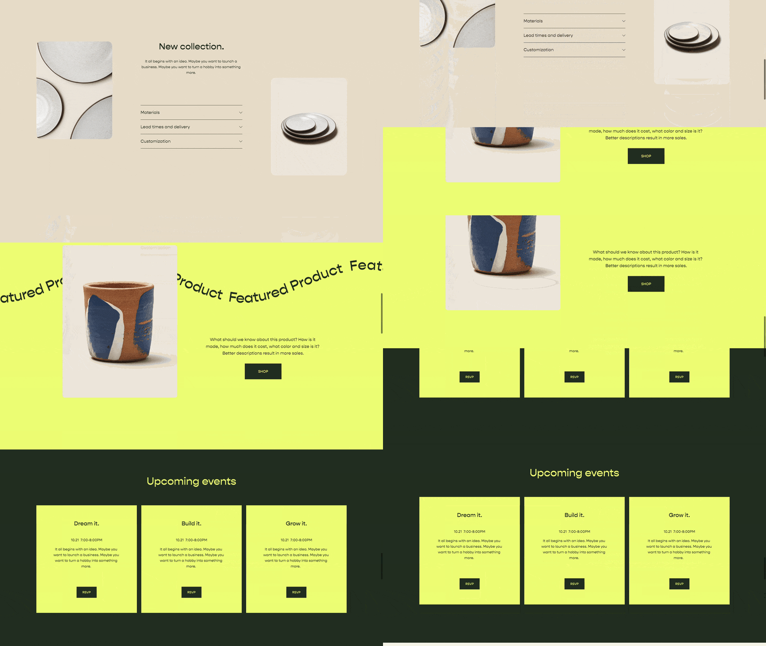
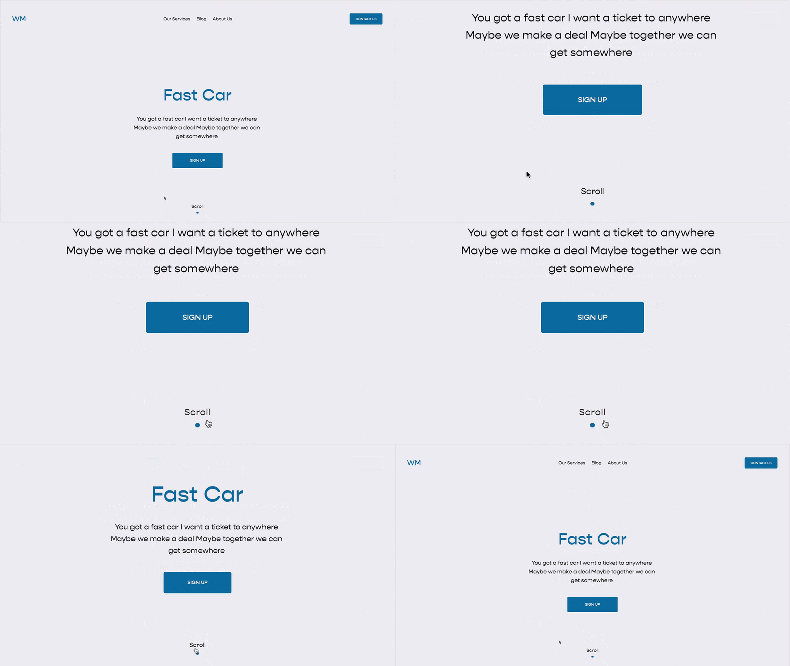
Page Section Visibility
This code snippet should be in everyone’s code snippet library. It allows you to show one section on mobile and a different one on desktop. This is great for fine-tuning page sections for specific screen sizes.
/**
 * Page Section Visibility
 * From Will-Myers.com
**/
body:not(.sqs-edit-mode-active){
  @media(min-width:768px){
    /*Mobile Section*/
    section[data-section-id="123"]{
      display:none;
    }
  }
  @media(max-width:767px){
    /*Desktop Section*/
    section[data-section-id="456"]{
      display:none;
    }
  }
}
What this does
Sometimes you might want to show one section on desktop and a completely different section on mobile. Maybe you want to display a horizontal image on desktop and a vertical image on mobile, or longer text on desktop and summarized text on mobile mobile. Whatever it is, there is a very simple way to toggle a sections visibility based on the screen width.
How this works
To use this code:
Add two page sections on your website. Be sure your two page sections are stacked one above the other.
Build out your sections. The top section is what we’ll show on desktop. The bottom section is what we’ll show on mobile. Be sure to toggle between the mobile and desktop views to get your layout just right.
Paste in the CSS from above into your Custom CSS area.
In the CSS, replace the section id’s with your section-id’s.
Replace section[data-section-id="123"] (line 8 above) with the data-section-id of the mobile section (second) you added. Use the Squarespace ID Finder tool to find the data-section-id.
Replace section[data-section-id="456"] (line 14 above) with the data-section-id of the desktop section (first) you added.
Related Code Snippets
The below Code Snippets are available to Code Curious members.


