Fixing the Tablet Spacing Problem in Squarespace Fluid Engine
Fluid Engine makes a bunch of new layouts possible in Squarespace. However, there is a major spacing problem when viewing a website in tablet mode. Let’s take a quick look at what’s causing it and how to fix it.
Update October 14th
Hey there, I've just created a fix for this. Grab the most updated version of the <script> below, version 1.1. When you replace that <script>, the drag handle should be accessible.
The problem
If you’ve built a Fluid Engine website, you might have noticed the “Tablet Spacing Problem”. Your website might look good on the two desktop & mobile views that Squarespace allows, but there are giant spaces in the in-between view, ie: Tablet view.
The reason this is happening is because Fluid Engine uses a grid-based structure. If you’ve taken my mini-course on CSS Grid, you’re familiar with this structure.
There is an invisible grid underneath our fluid engine sections and when we add grid items, like a text block or an image block, the height and width of these items will snap to the cells in the grid.
In the example above, the text & button blocks will always fill up the cells that they currently encompass. The button will take up those 8 cells at the bottom — 4 columns and 2 rows, and the text will always be 7 rows tall and 18 columns wide.
On devices smaller than 750 pixels wide, the grid from changes from the “desktop” mode of 24 columns, to the “mobile” mode of 8 columns. We see a slightly different grid, but the same principle applies.
Our text takes up all 8 columns, and 12 rows. Our button is below and takes up all 8 columns and 2 rows.
But here is where we run into the problem. On devices just under that 750px breakpoint, our spacing gap occurs.
The text block is still taking up all 12 of those rows even though it only needs 4!
How Blocks are Sized In Fluid Engine
The height of any block you add into Squarespace is sized either extrinsically or intrinsically.
Extrinsically - me, the user, gets to determine the size
Intrinsically - the content within the block gets to determine the size
For example, Image Blocks are extrinsically sized. I can determine the height of an image block, and the image within it will adjust to the height I set.
Alternatively, text blocks are intrinsically sized. The height of text blocks is determined by the size and amount of text within the block. If I try to make a text block smaller than the content, I can’t and am presented with a red bar preventing me from making the block smaller.
However, text needs less line breaks on wider screens. Additionally, the row height of the grid increases on larger screens, creating even more space.
On our mobile view the text needs to take up 12 rows. But on our tablet view, the row heights are larger AND the text takes up only 3 lines.
However, the only editing option we have is the “mobile” mode Squarespace provides, and our intrinsically sized blocks won’t get any smaller, AHHHHHHH!!!
Removing that pesky space
So the solution here is to size our text blocks based on a tablet, using as few rows as possible. Luckily, I was able to build some code that allows you to do just that!
The cost of free
I’m offering this code for free because I know how important this is to Squarespace users, especially now that Fluid Engine is out. However, this does cost time and energy for me to maintain. If you’re able to, consider buying me a coffee to support the upkeep and maintenance of this plugin.
Add this code to your Settings » Advanced » Site Footer Code Injection area
<!-- Custom Breakpoint From Will-Myers.com -->
<script src="https://cdn.jsdelivr.net/gh/willmyethewebsiteguy/customBreakpoint@1/customBreakpoint.min.js"></script>
If you’re on a personal plan and don’t have access to this part of your website, no problem. Add a “Markdown” Block into the Footer area of your website and paste in the code there.
Now paste in this code to your Design » Custom CSS area:
html {
  --sqs-edit-mode-breakpoint: 749px;
}
Now, when you hit the “Mobile” icon, the mobile breakpoint will display as the screen size you’ve defined on that variable.
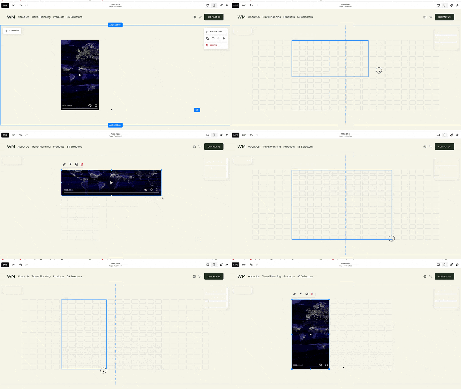
With our new “mobile” mode set to 749px, we can remove all that empty space.
And yes, this still looks good on mobile. The rows that comprise the text are expanded so that they can still hold the content.
This code won’t work if you use a breakpoint larger than 749px. Anything larger and Squarespace will display the 24 column grid for desktop.
As always, let me know if you have any questions!
Keep building,
Will
Breakpoints
Here is a list of important breakpoints you might want to use / test. Please comment below any others that might be useful for this list:
Squarespace Specific
Default SS Mobile Breakpoint: 428px
Fluid Engine Breakpoint: 749px
Common
mobile devices: 320px — 480px
iPads & tablets: 481px — 768px
large tablets & small laptops: 769px — 1200px
large laptops / desktops: 1200px — 1800px
External Monitors: 1800px and above
Related Code Snippets
The below Code Snippets are available to Code Curious members.


